Betterhand / BHFT
Betterhand identity for algorithmic trading and BHFT for HR communications.
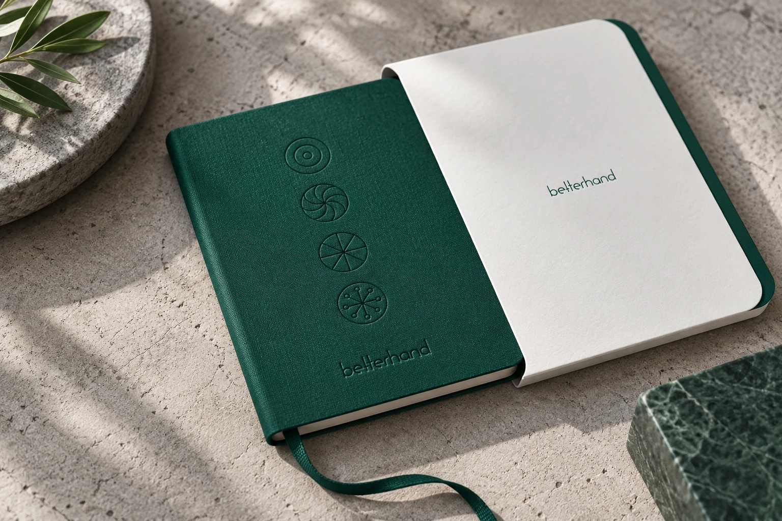
Precise forms. Focused on results.
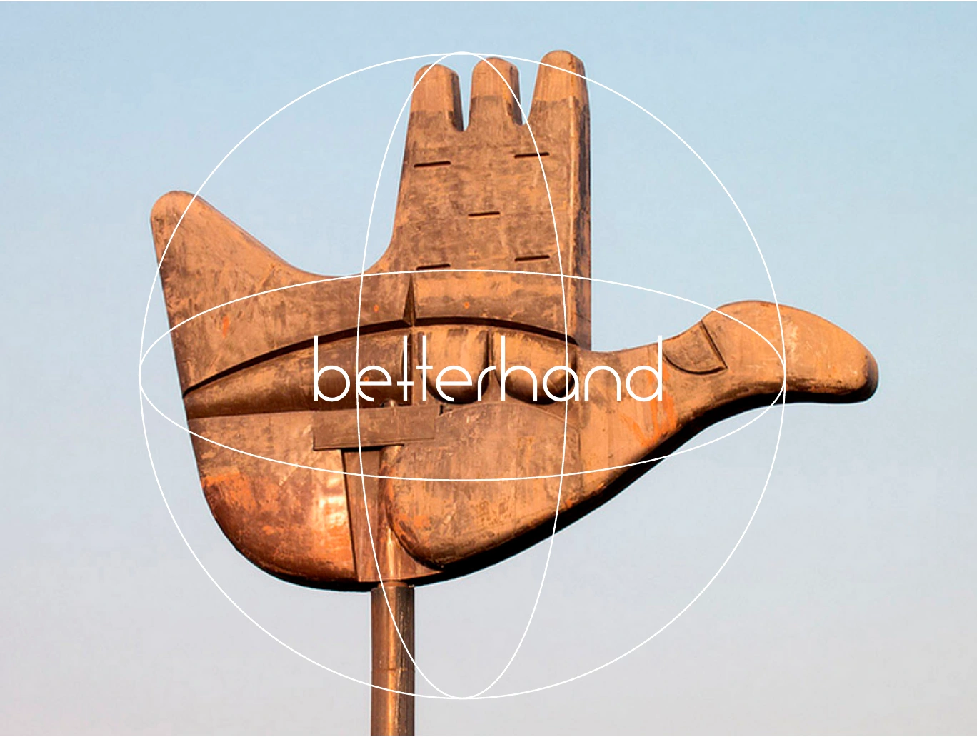
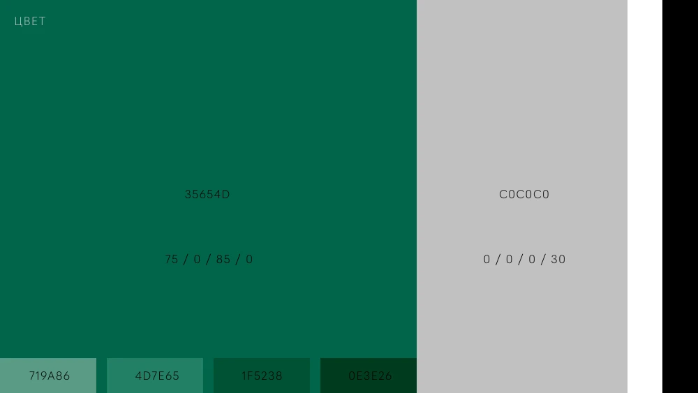
In this project, Betterhand is the algorithmic trading business brand, while BHFT is the employer brand for developers and mathematicians. The brief called for distinct audiences with shared values: straightforwardness, focus, curiosity and enthusiasm. Fine geometry and circular modules connect the two directions. Betterhand received a restrained green-and-silver system; BHFT added colour and a more open tone for HR communications.
Focus becomes graphics
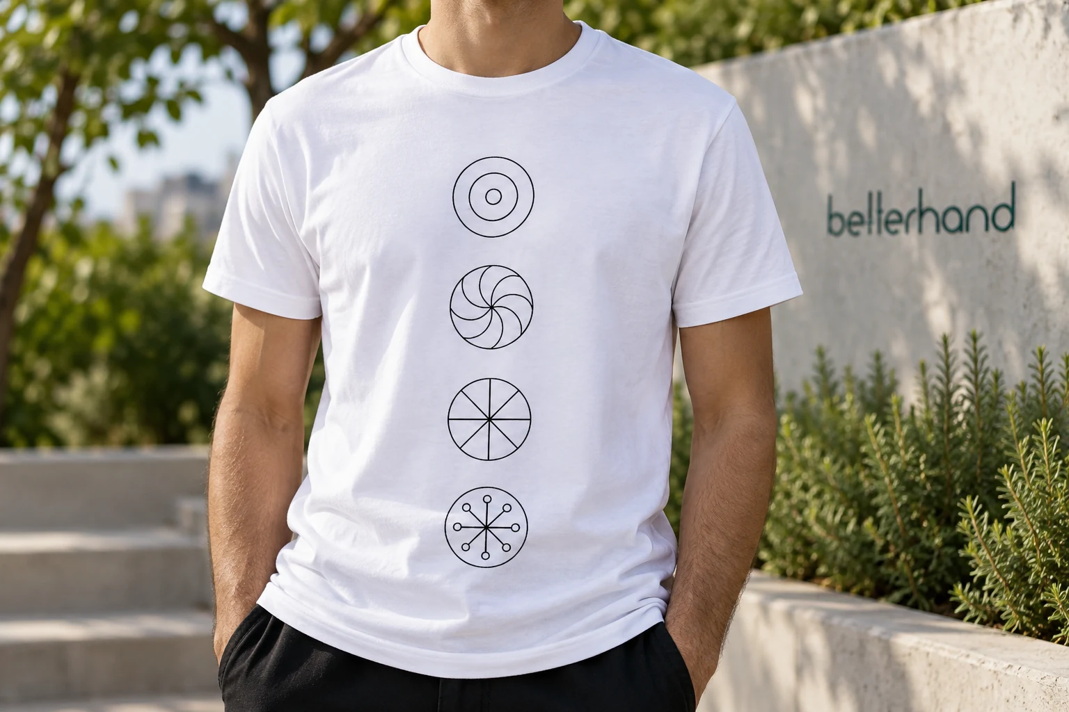
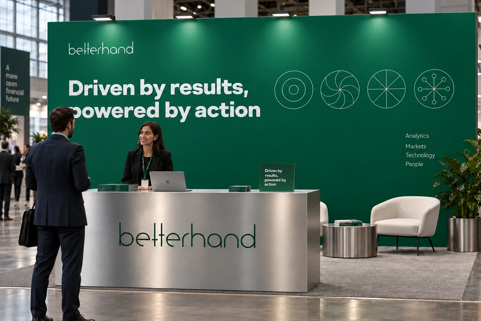
Circular pictograms are built on a 10 × 10 grid. Their number in a composition is limited: graphics direct attention rather than fill available space.
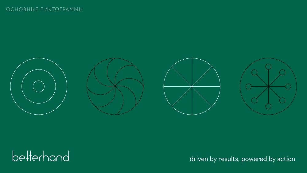
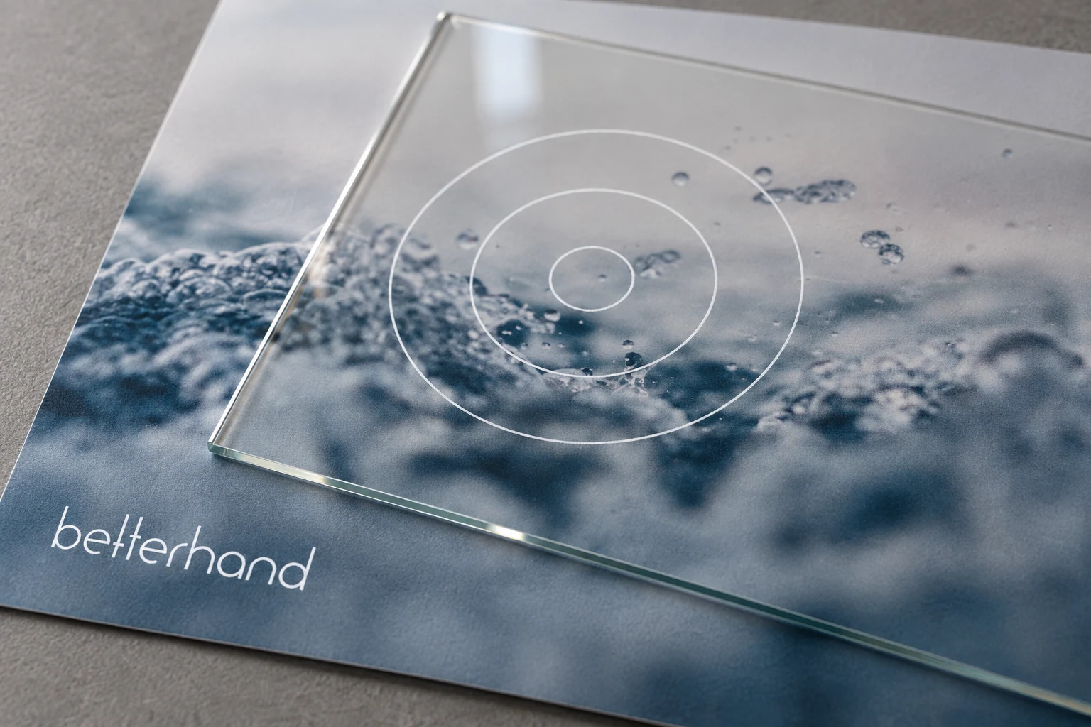
Betterhand’s voice
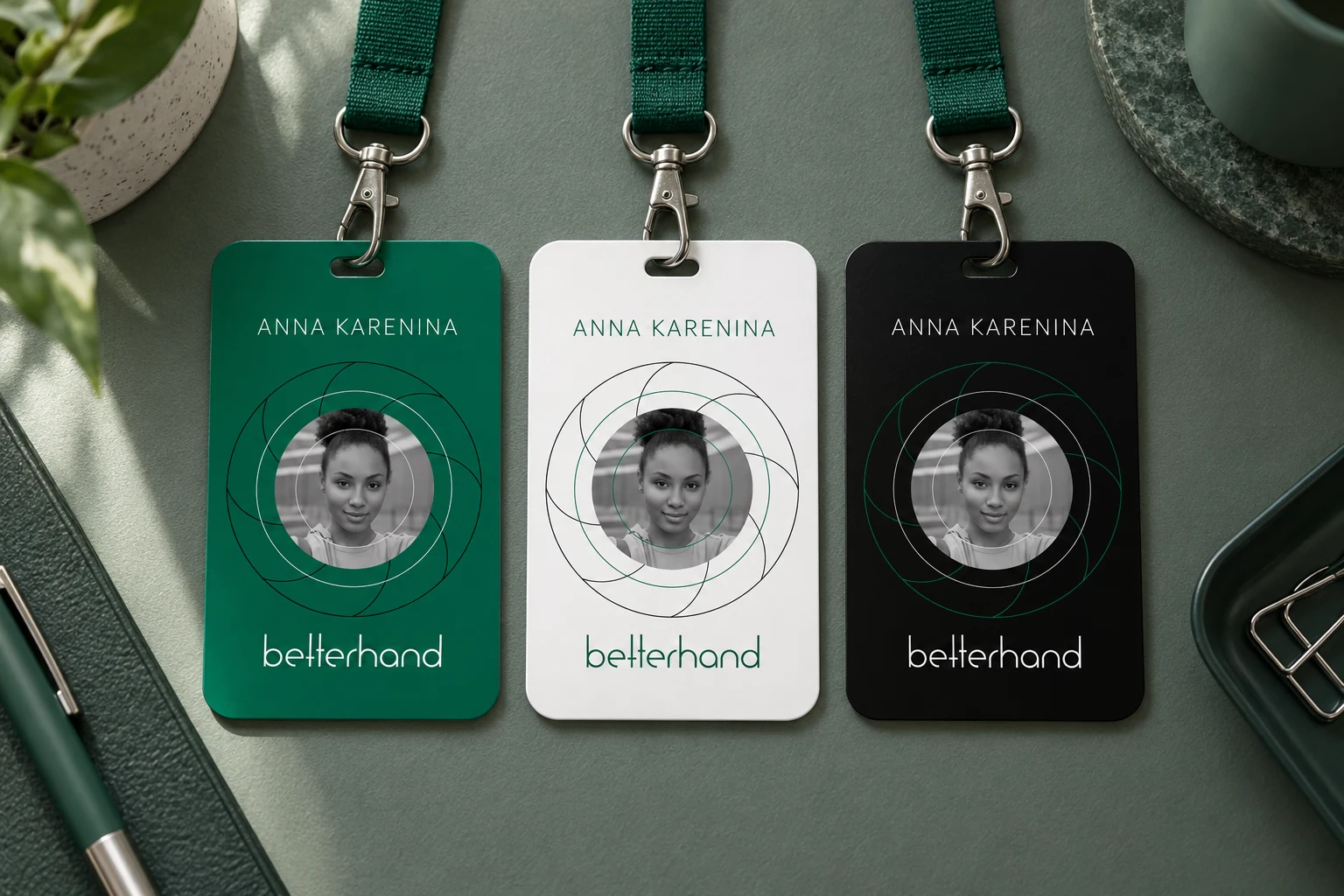
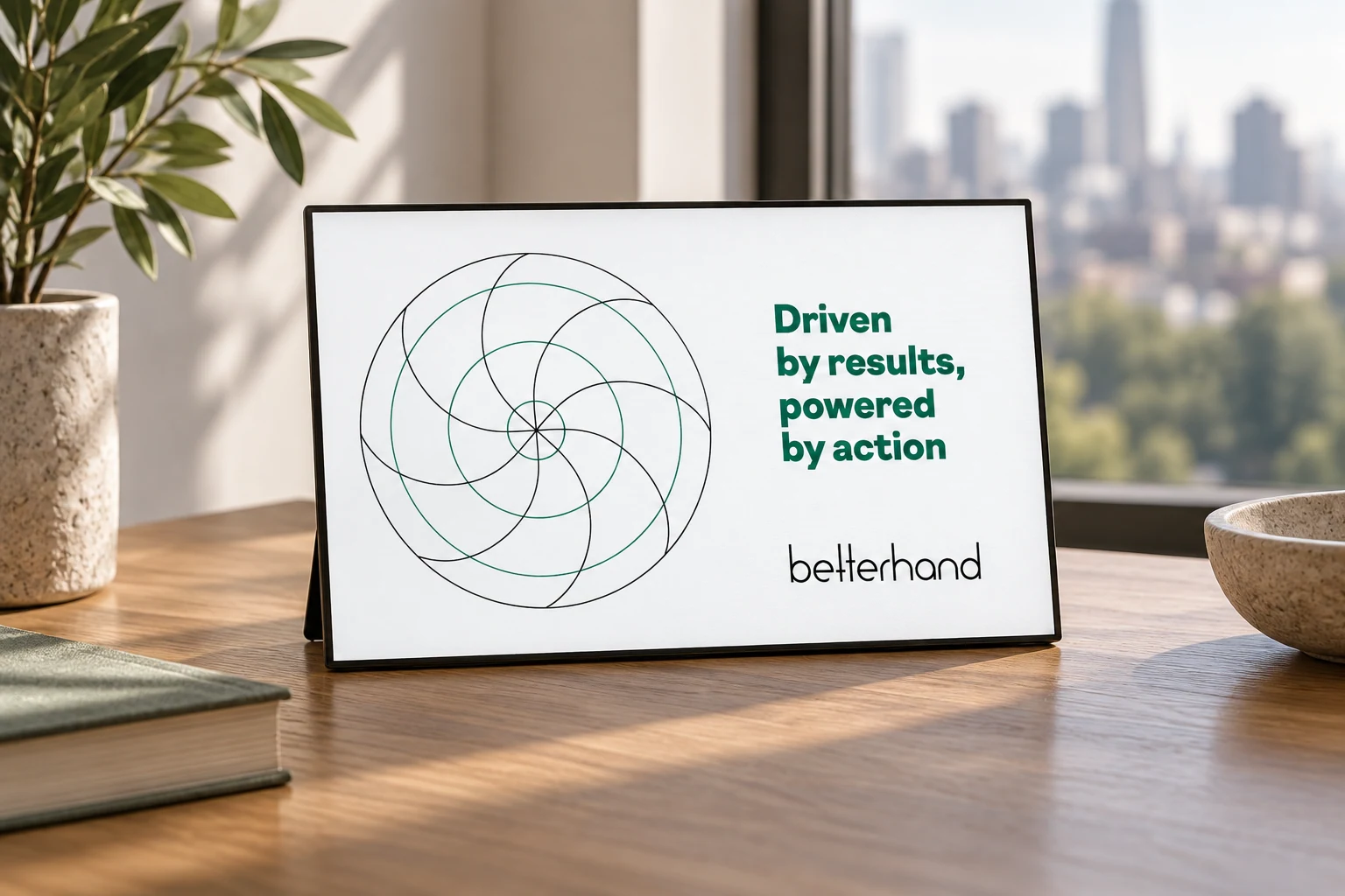
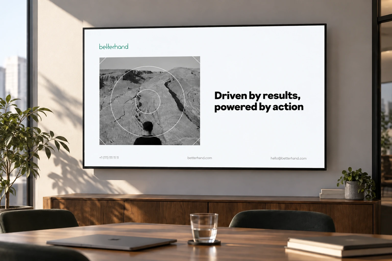
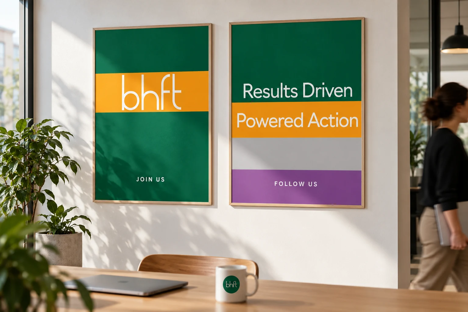
Navigo assigns information roles from a fine line to a bold headline. Soft natural photography balances precise geometry; “Driven by results, powered by action” connects the communication.
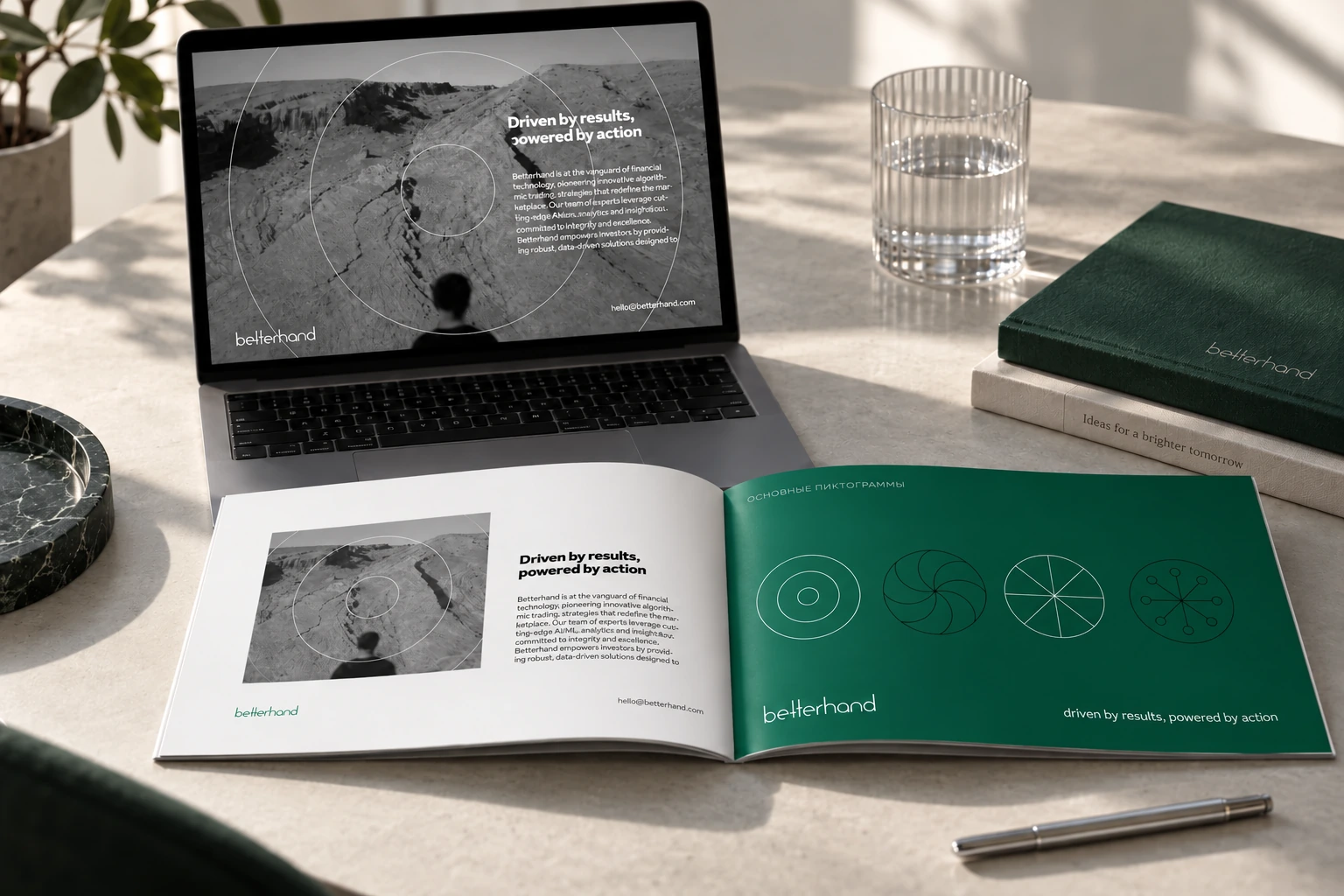
A system for everyday work
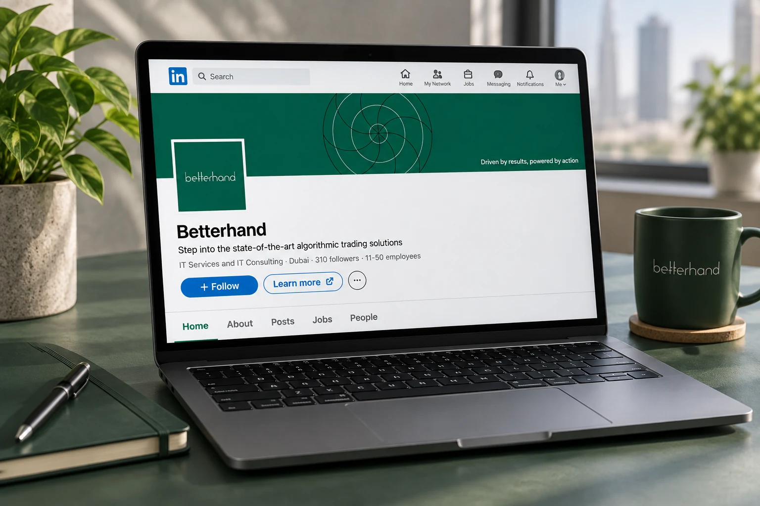
The guide extends the rules to documents, correspondence and office objects. Symbol scale, clear space and a quiet hierarchy retain one tone in practical formats.
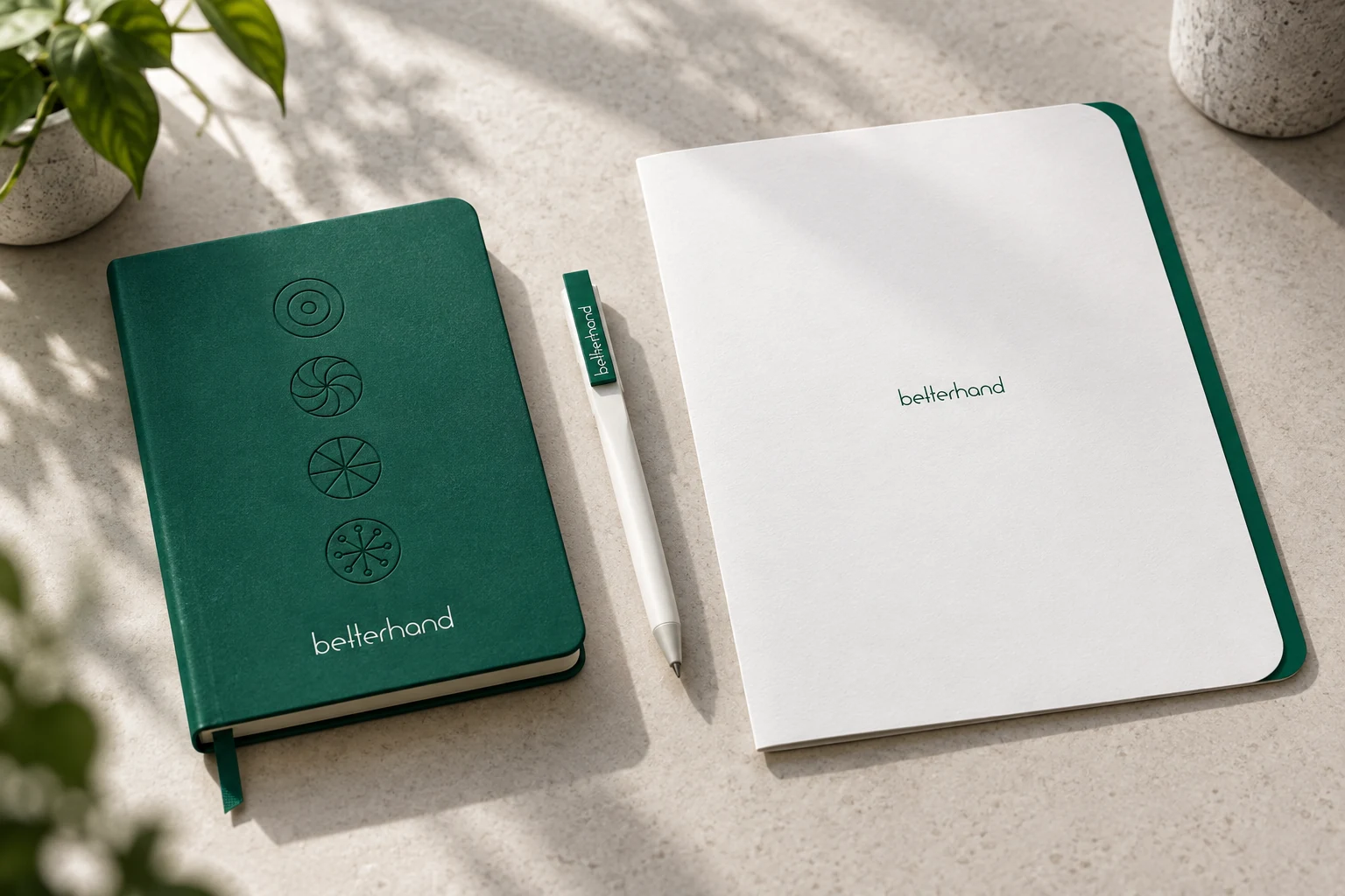
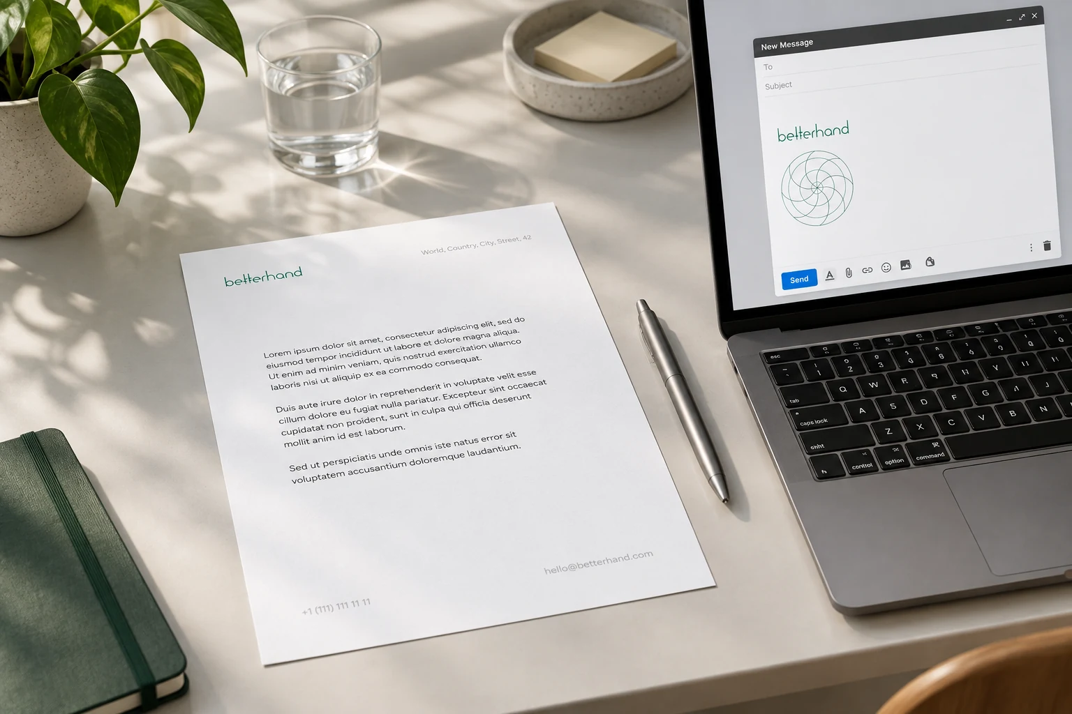
A different tone for the team
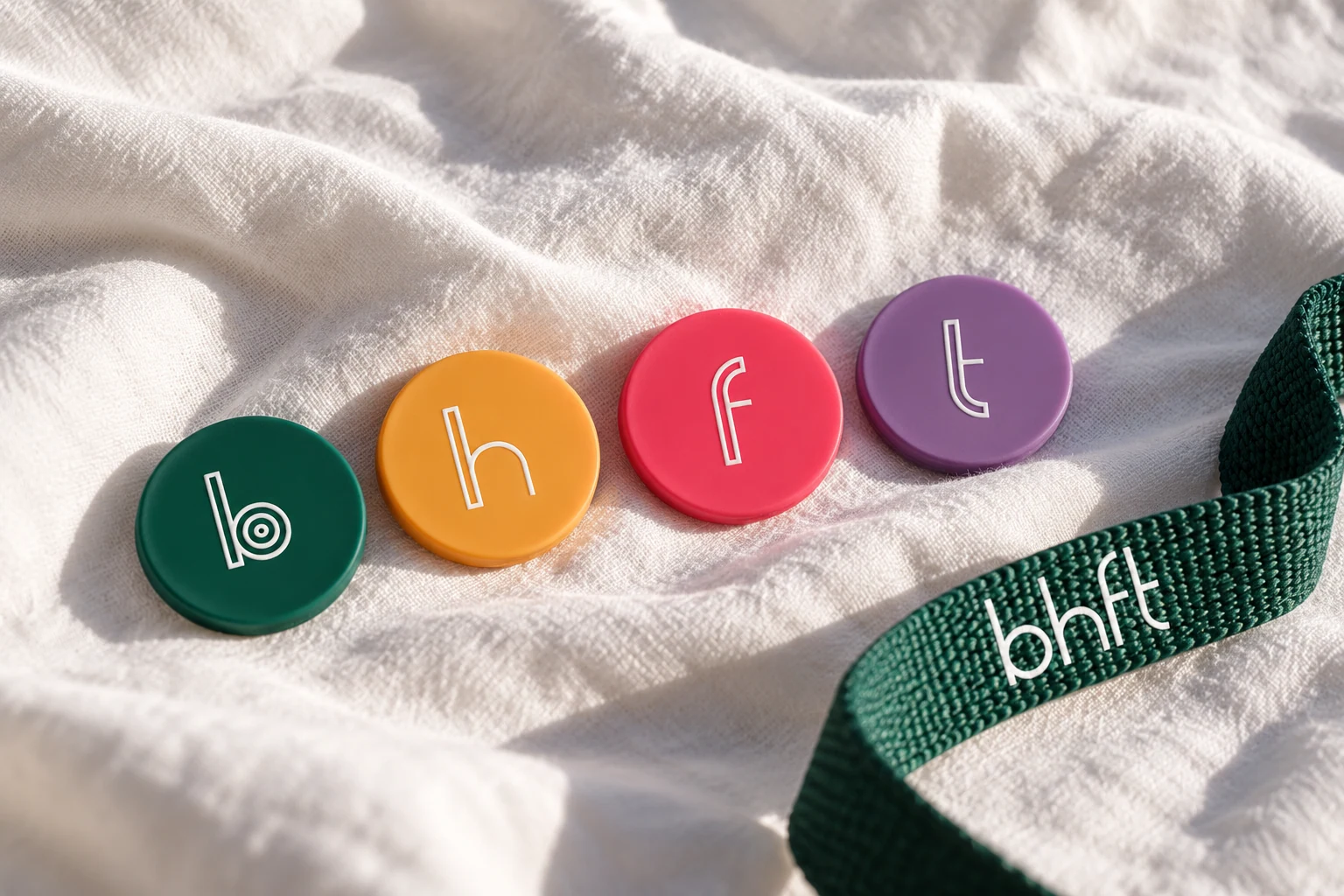
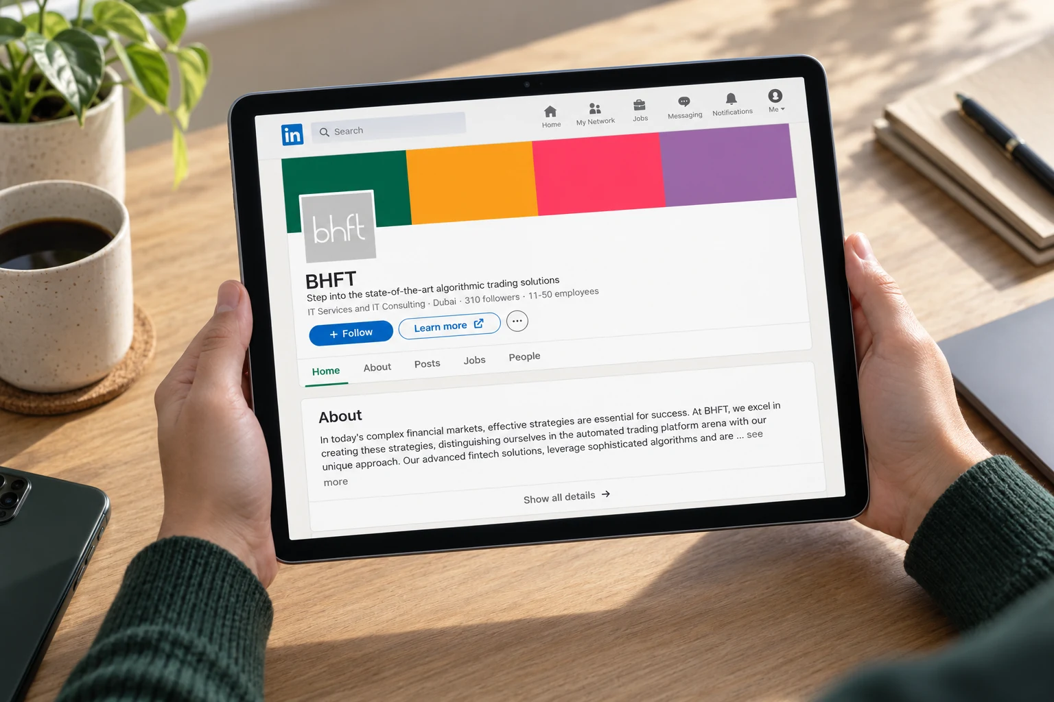
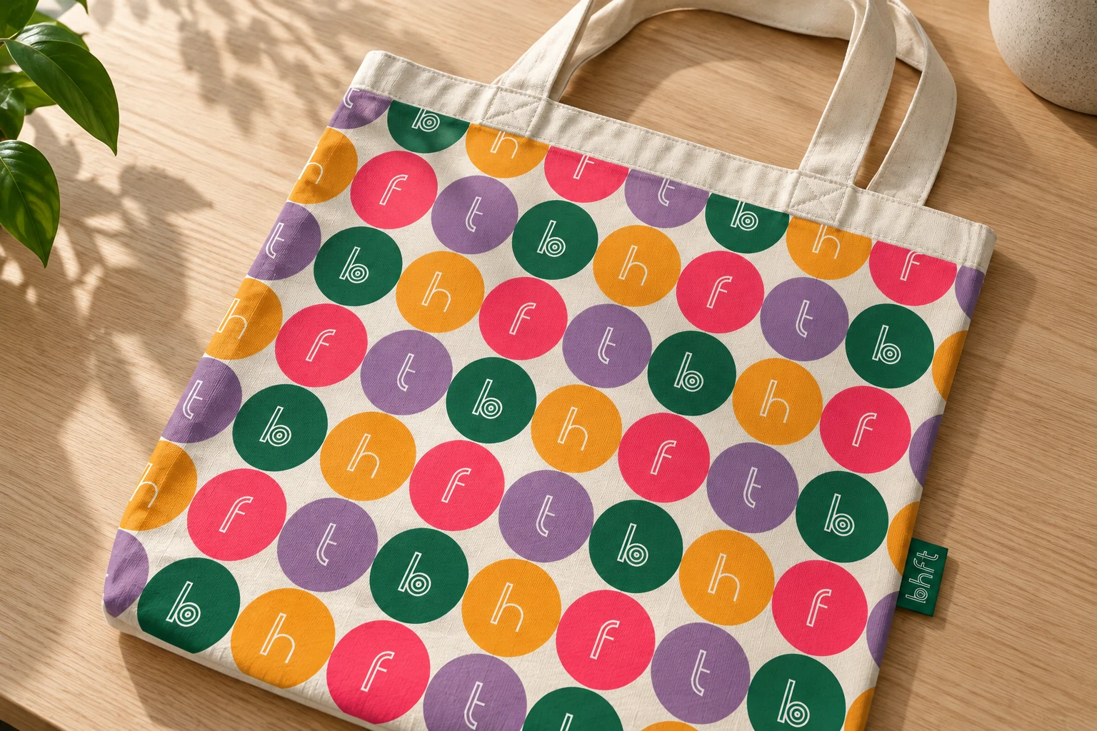
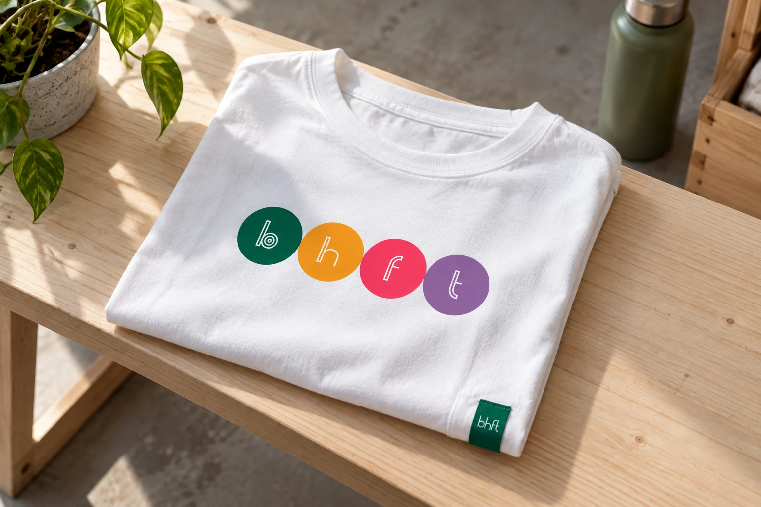
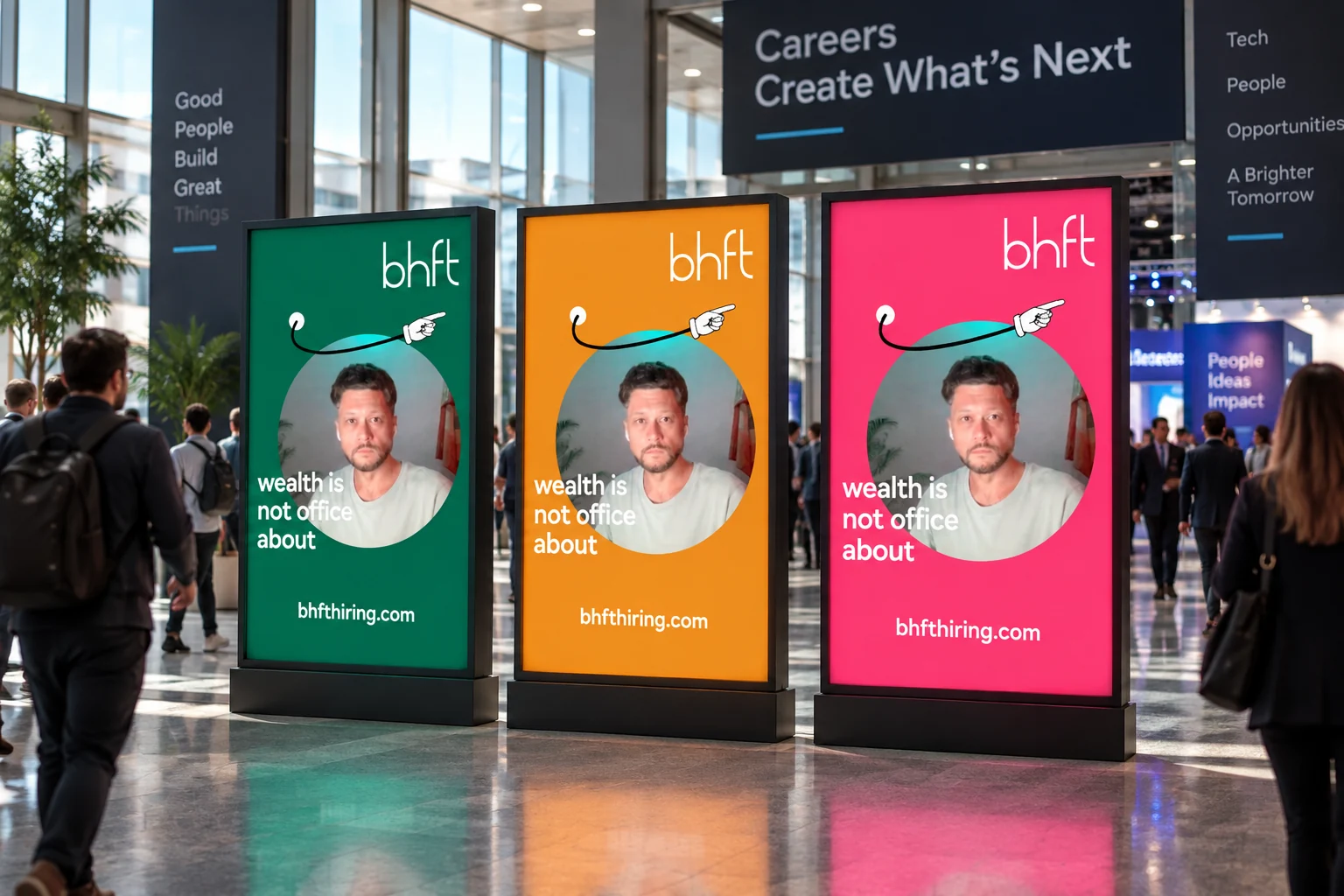
BHFT’s HR communications add orange, pink and purple to green. Letters can occupy four coloured modules and form a pattern. Shared geometry preserves its relationship with Betterhand.
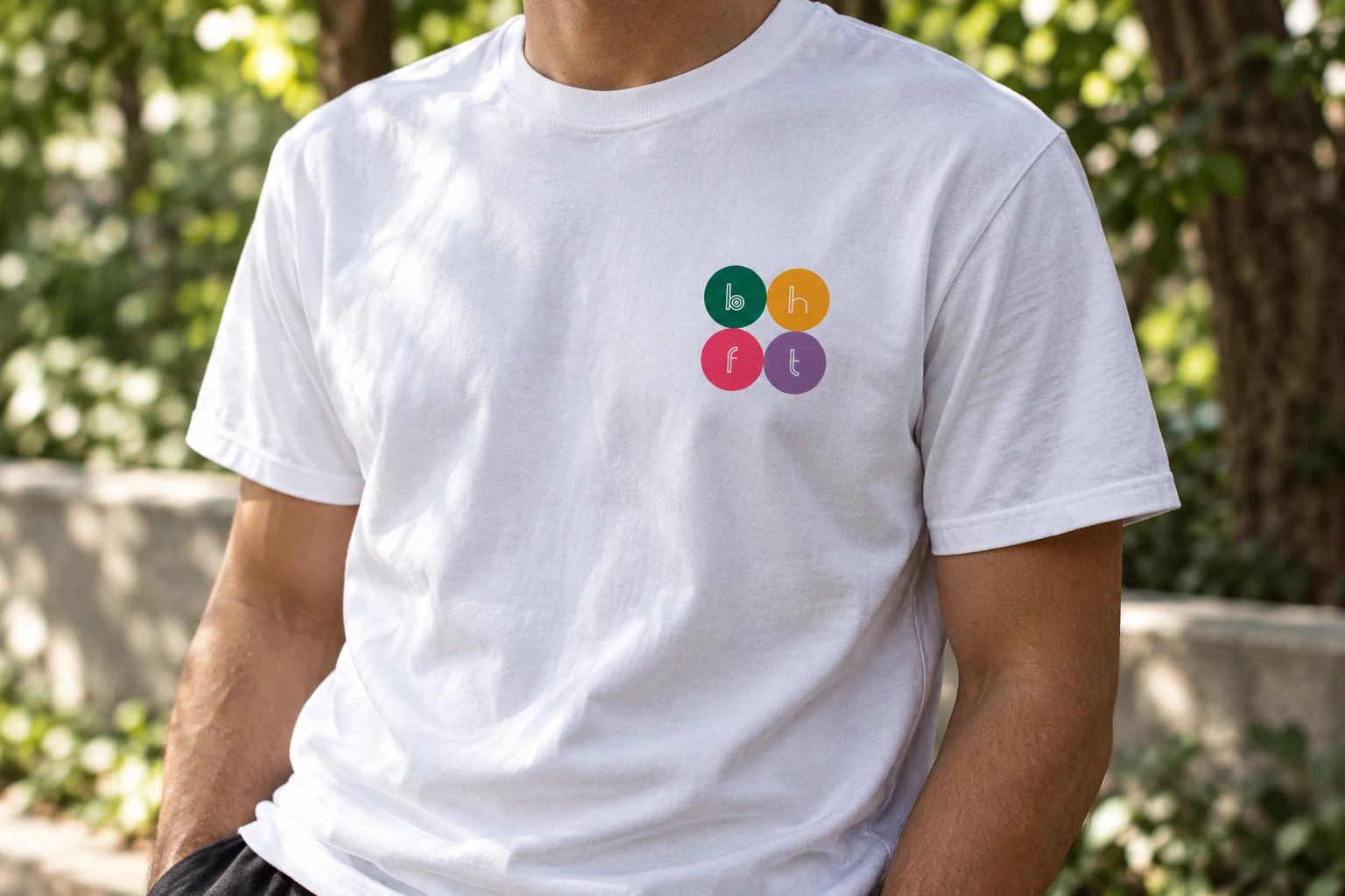

The rules on the website
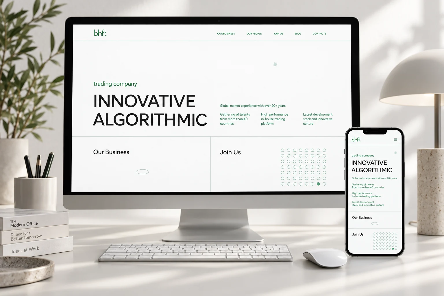
Circular modules preserve the connection between the brand architecture and the website. Large typography separates the business message from the team sections; clear space and a fine grid establish a shared rhythm.
FINPRPR for startups