Jack-Jack
An identity with a sense of rhythm.
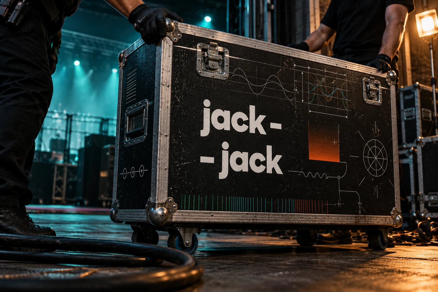
Shape is sound. Colour is light.
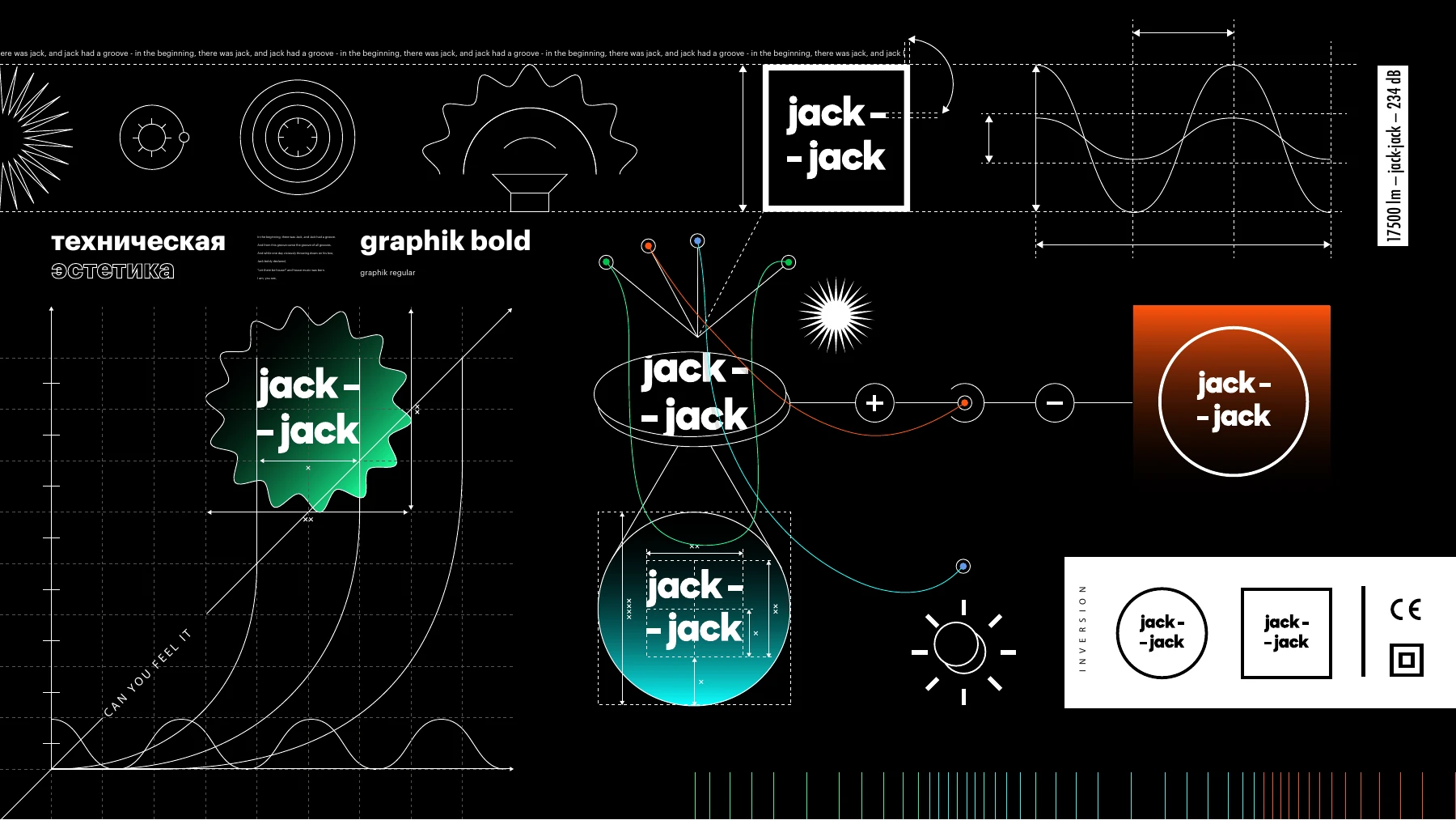
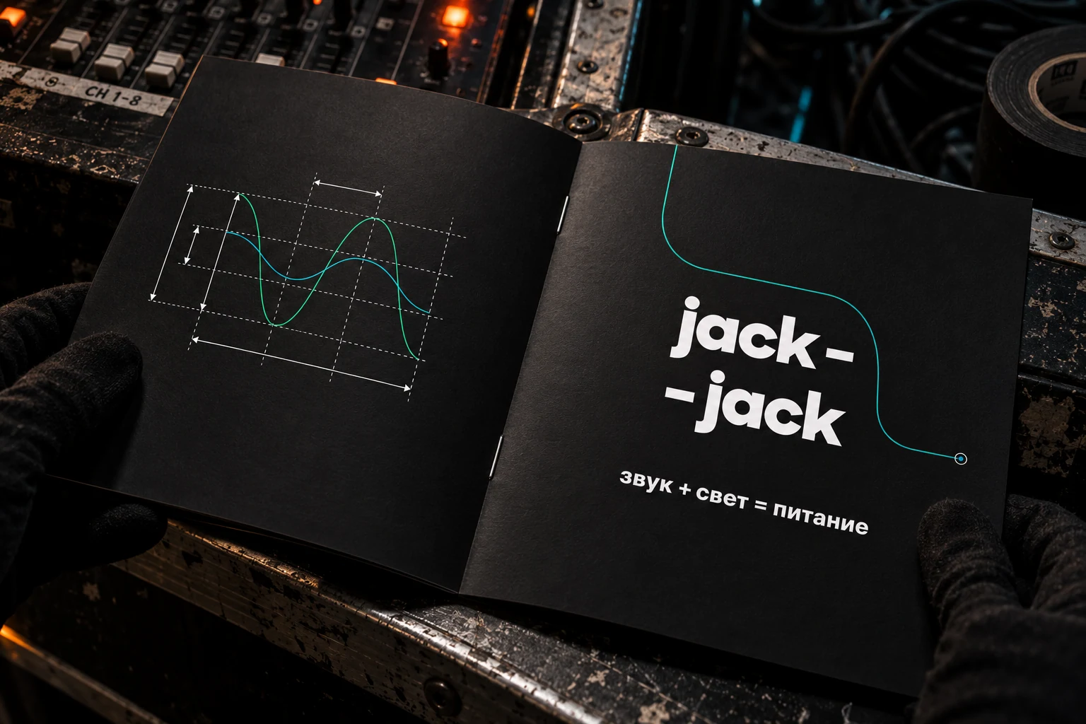
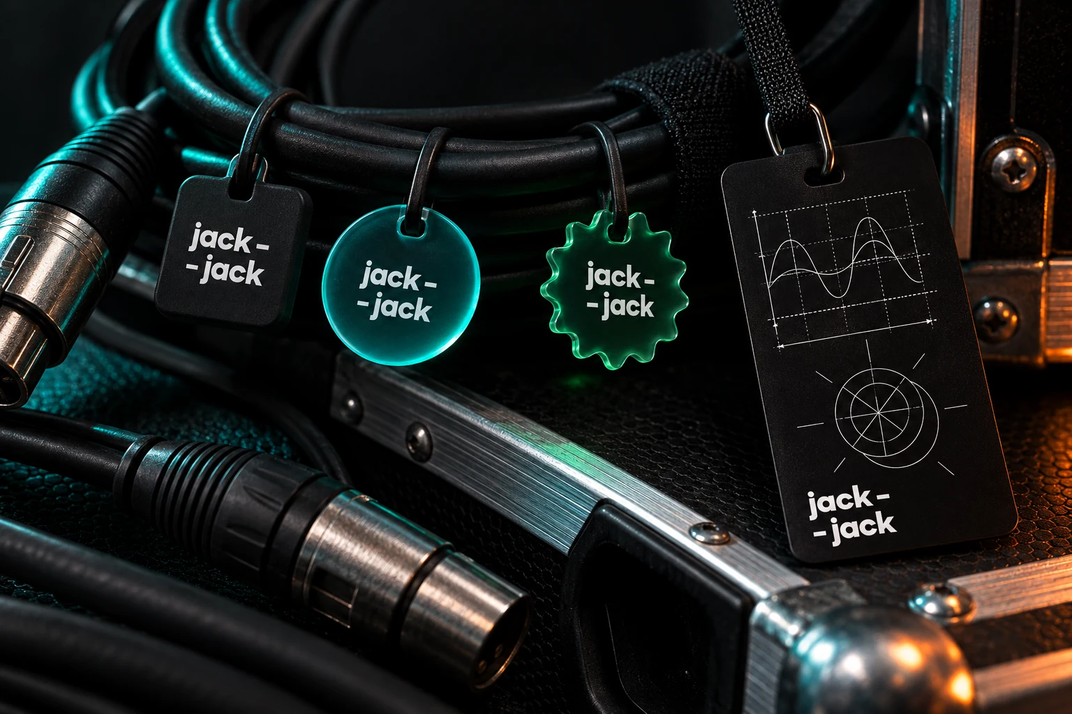
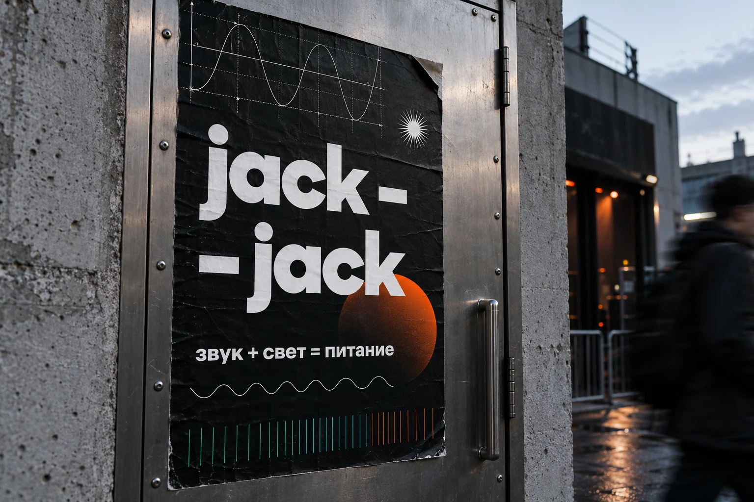
An equipment rental service received the name Jack-Jack and the formula “sound + light = power”. The identity uses its audience’s working language: circuits, cables and oscillations. Fine lines give the system movement and bright shapes provide accents of light. A stacked logo and restrained information typography keep the technical layer clear.
Technical and expressive layers
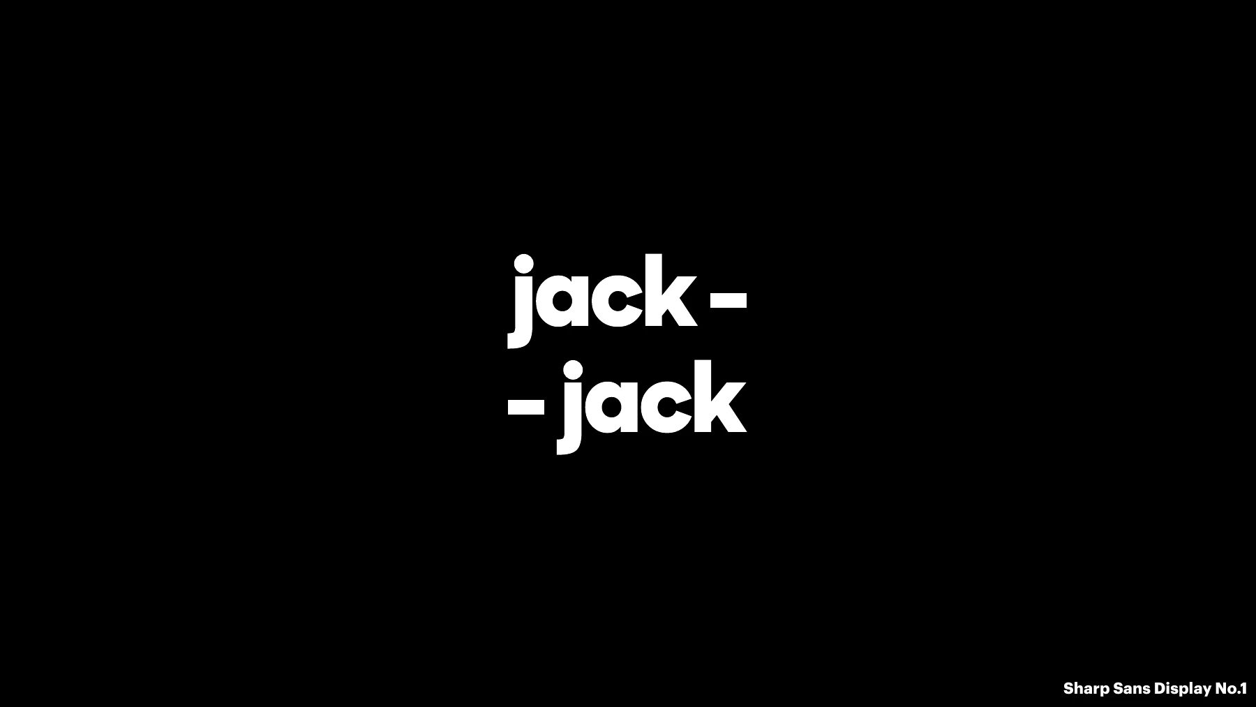
Sharp Sans Display No.1 defines the wordmark, while Graphik carries practical information. Distinct roles combine graphic energy with precise data.
Light as part of the system
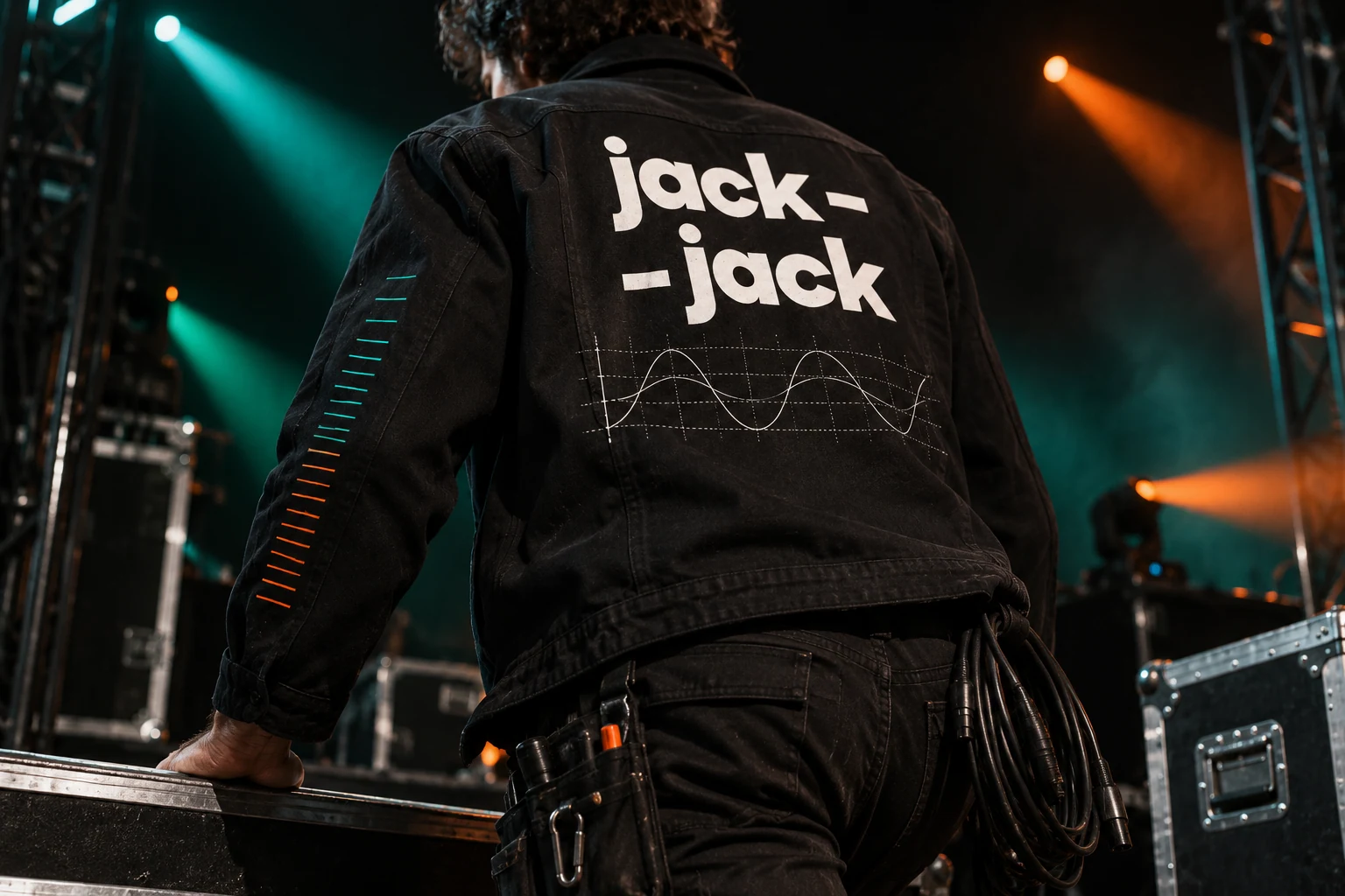
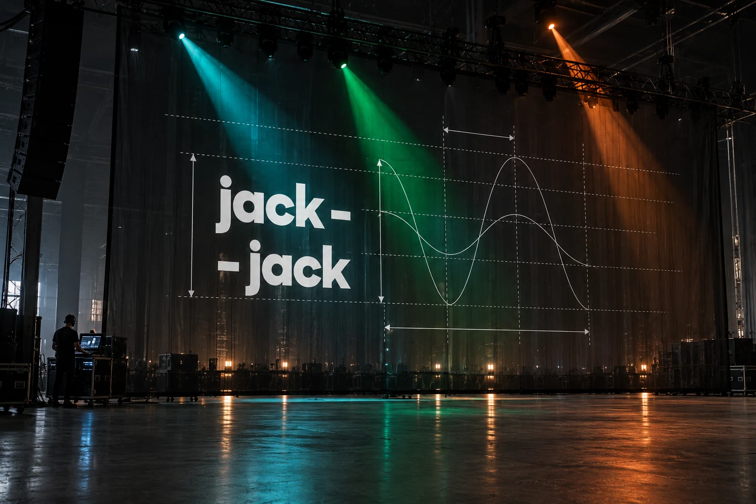
The photographic direction uses light and backlight. Linear graphics follow this logic, allowing illumination to change the mood without introducing a new set of elements.
Next project
Buro 23A reassuring kind of cover