Buro 23
A guardian angel in a single yellow stroke.
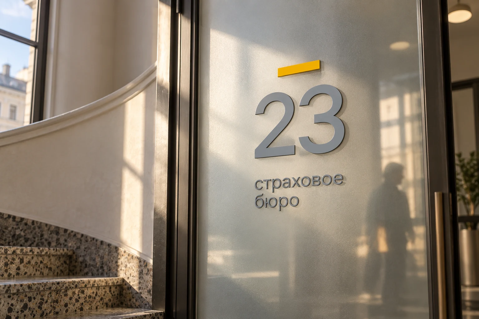
Calm, reliability, care.
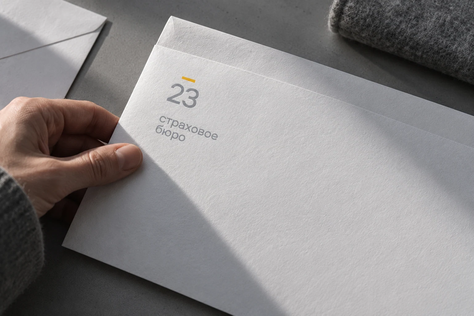
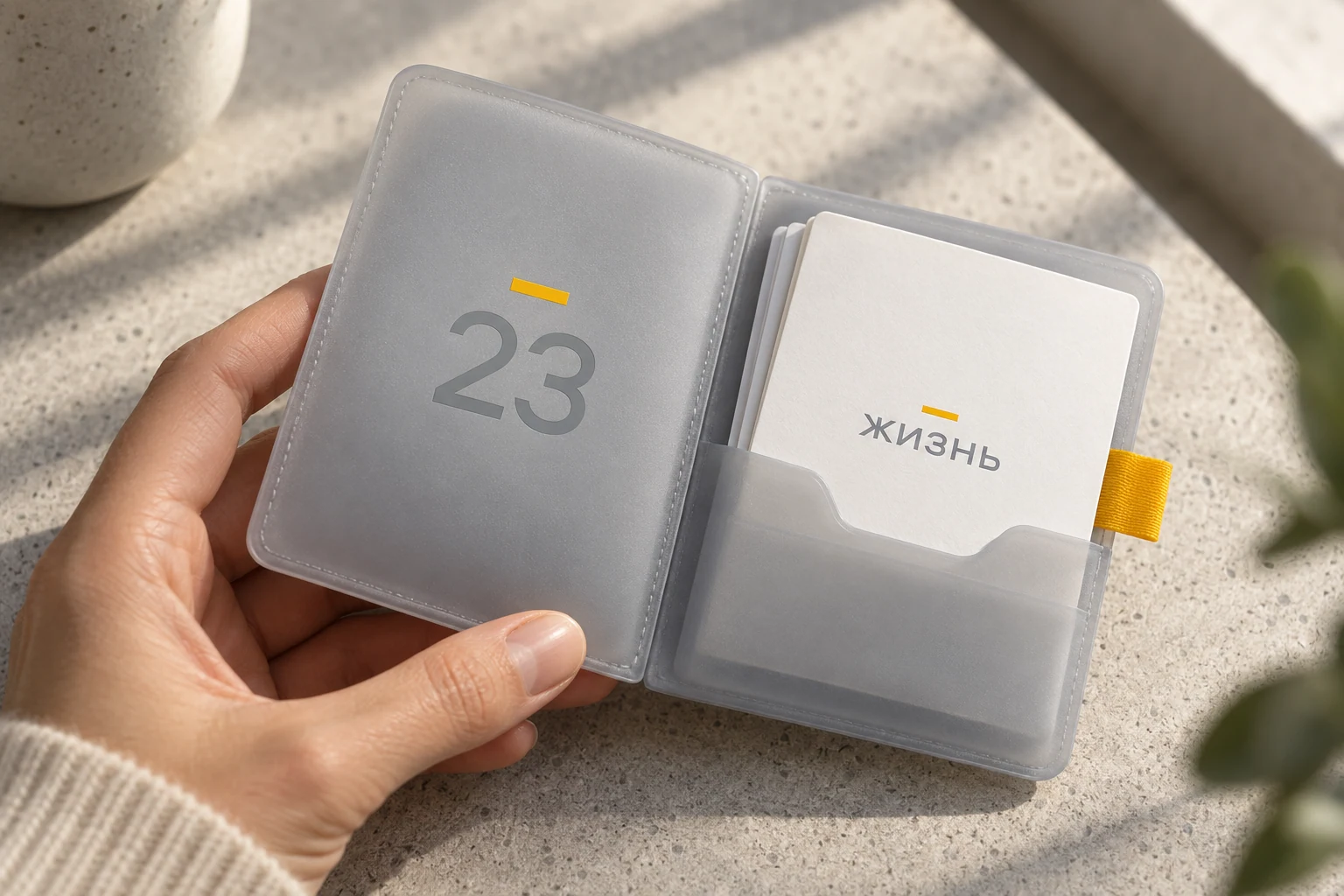
The insurance bureau needed a clear, calm way to speak about protection. The guardian-angel metaphor was reduced to a single symbol: a yellow halo. It connects the name, numerals and pictograms, making the system recognisable without elaborate illustration. Restrained typography and a grey background leave room for a clear service message.
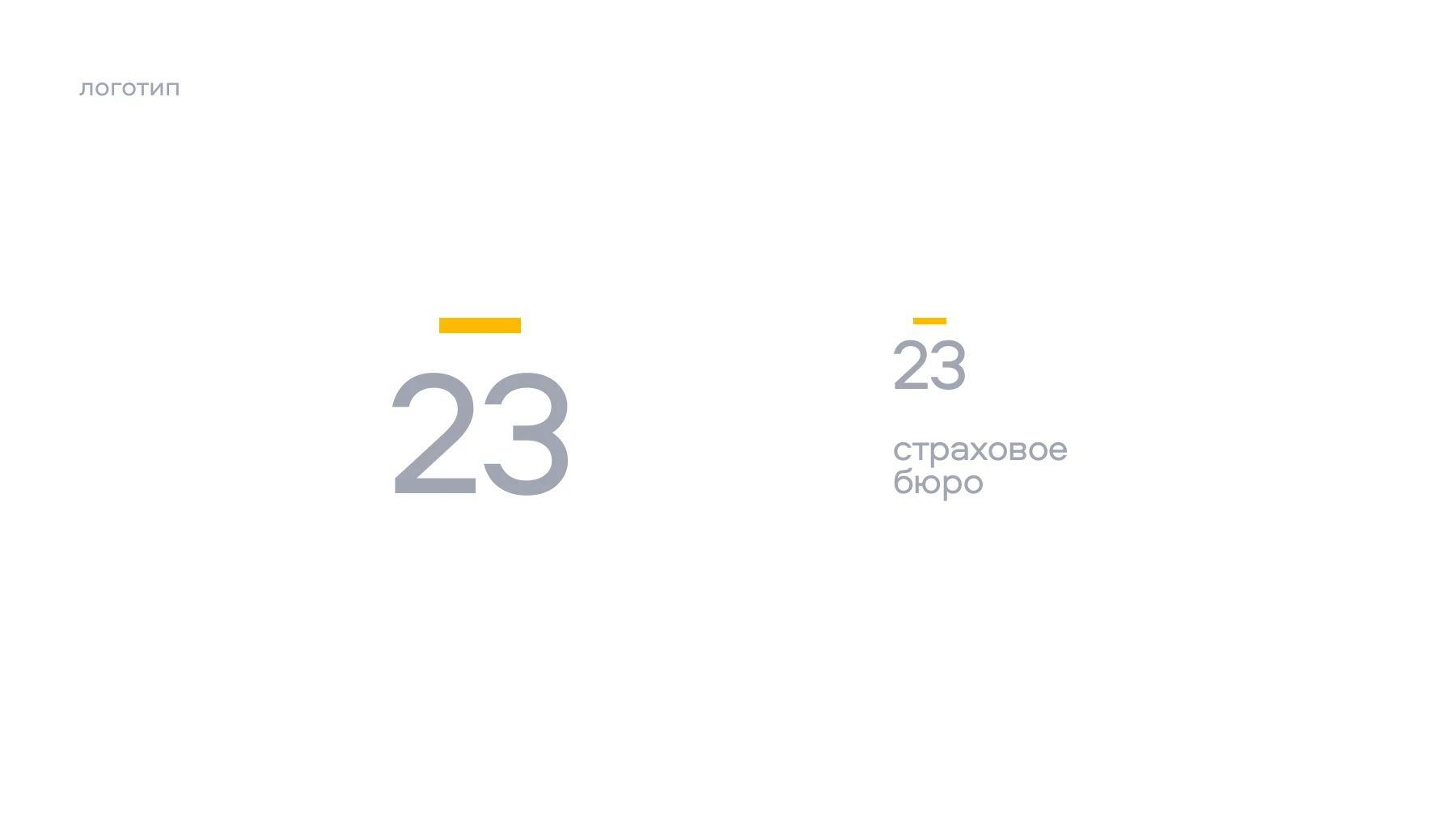
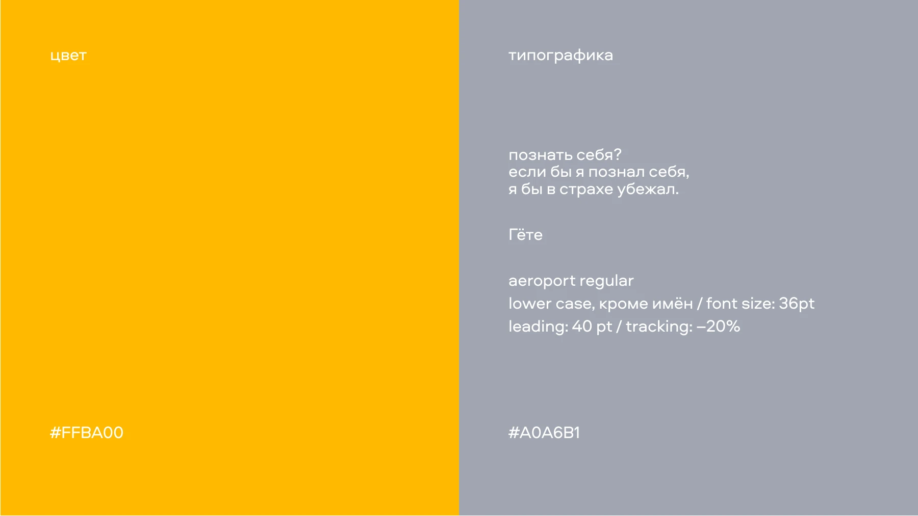
A small set of elements
Lowercase Aeroport and a white-grey-yellow palette establish a calm voice. Consistency matters more than the number of graphic devices.
Care as a constant symbol
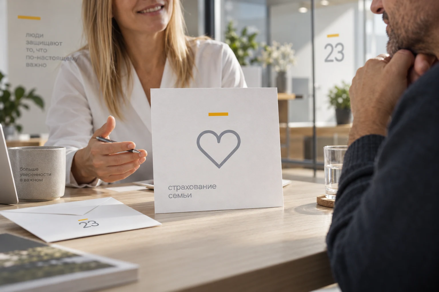
The halo connects different insurance subjects. Messages can change their story while retaining one concise symbol of protection and a clear hierarchy.


A rule for social media
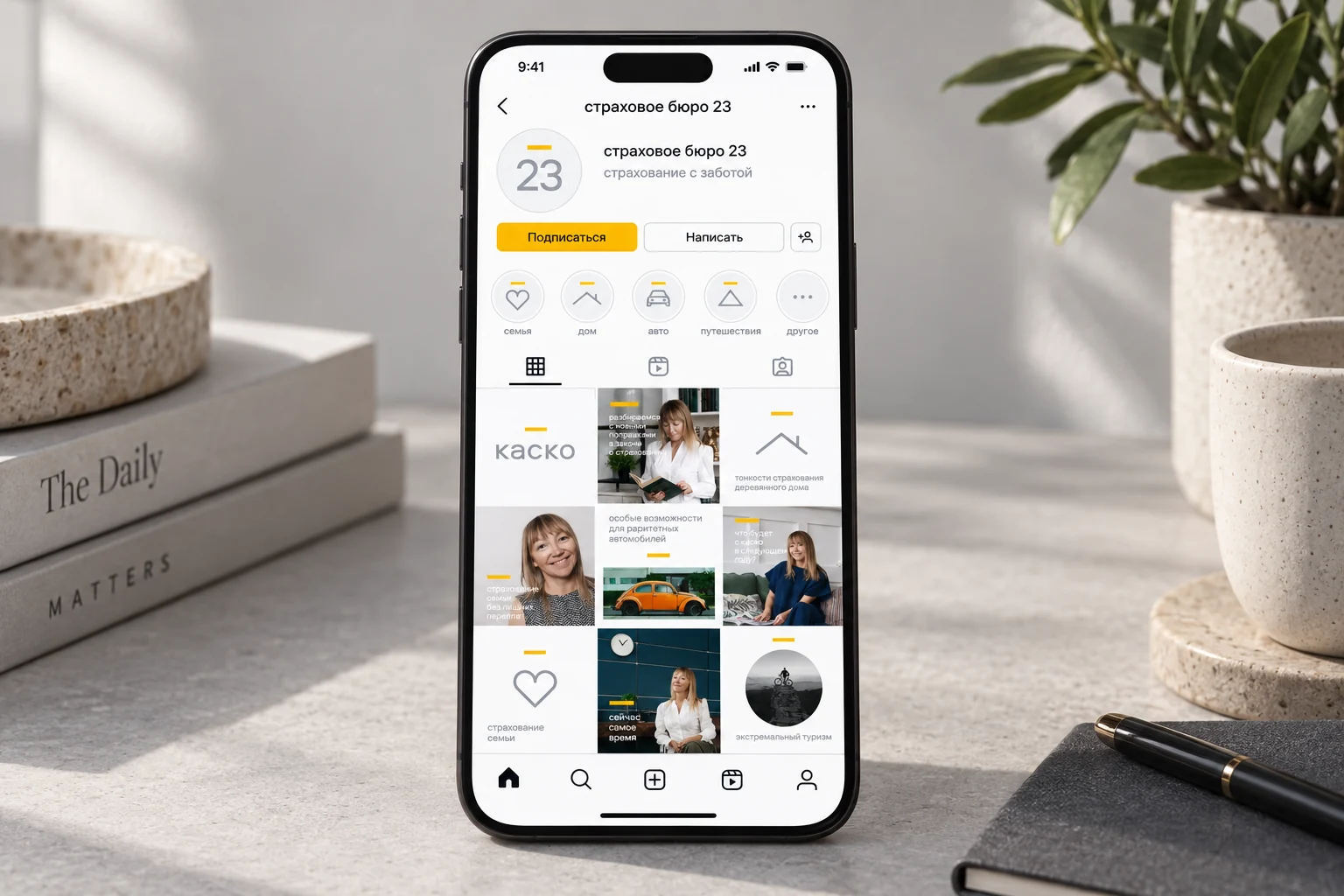
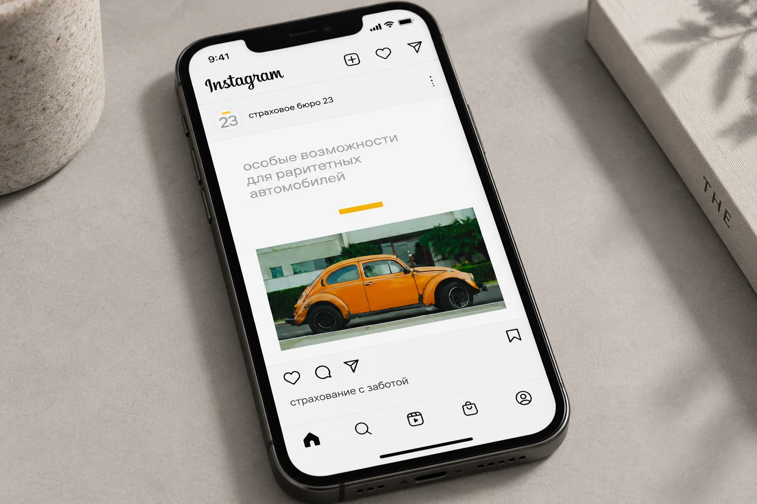
The original presentation defines an Instagram grid: light messages alternate with photography, while short headlines and the halo retain one voice. Light posts also vary, avoiding consecutive repetitions of the same typographic, icon or image treatment.
Ura! DeliveryJoy on its way