Simple Sport
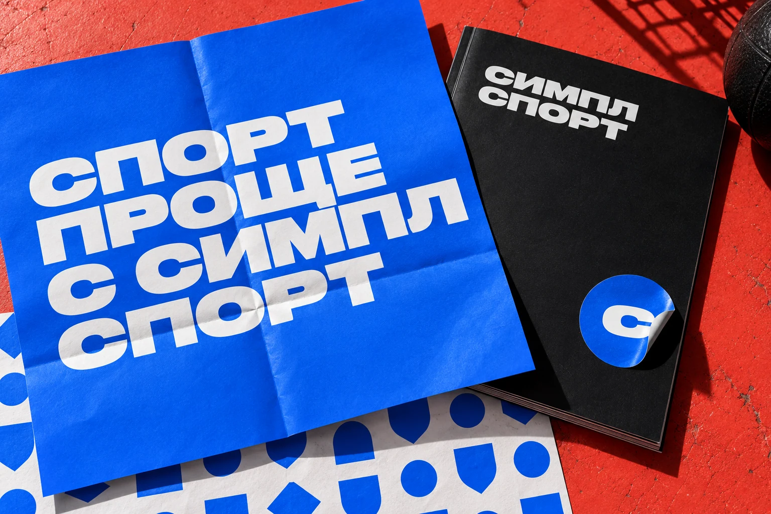
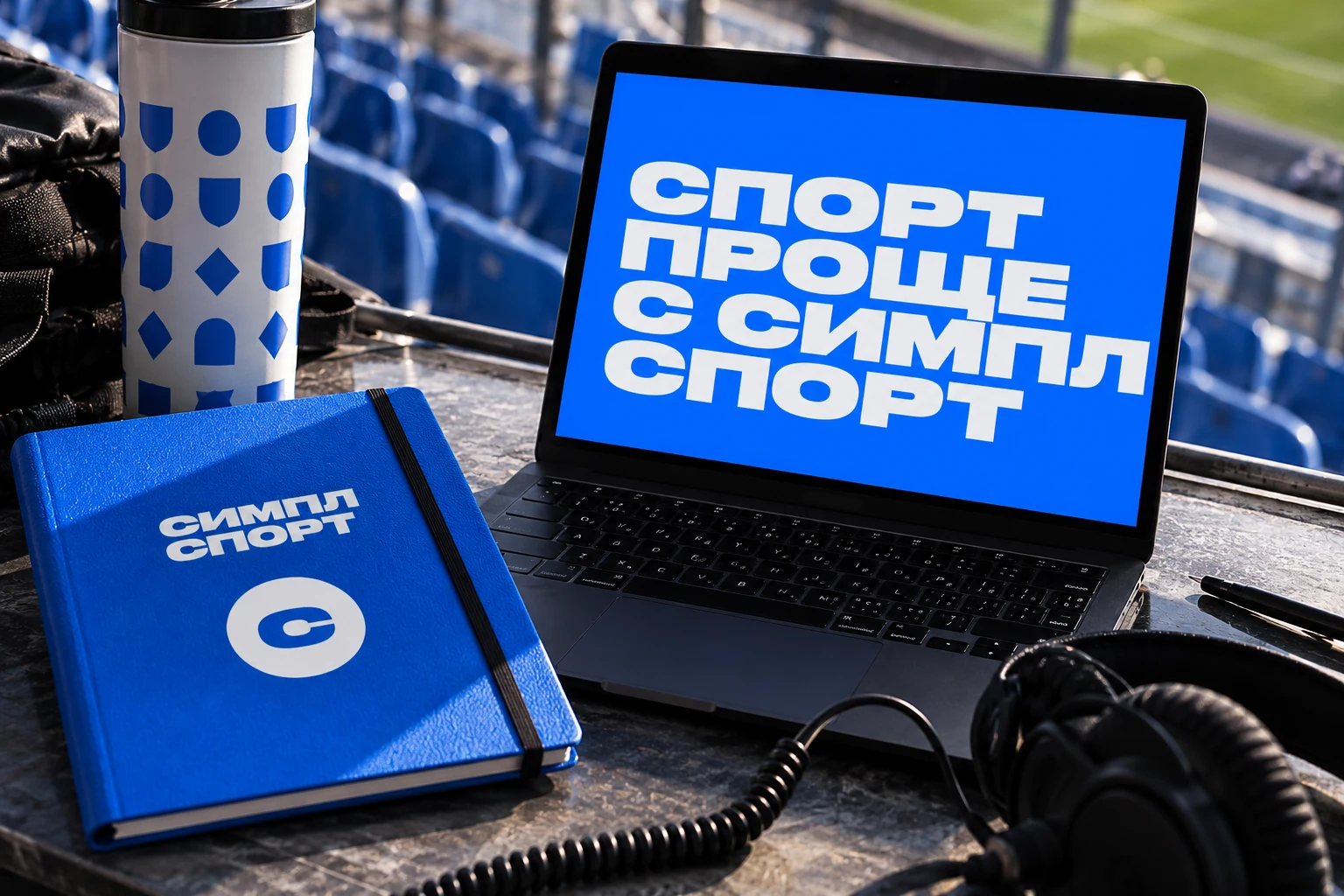
Sport, made simpler.
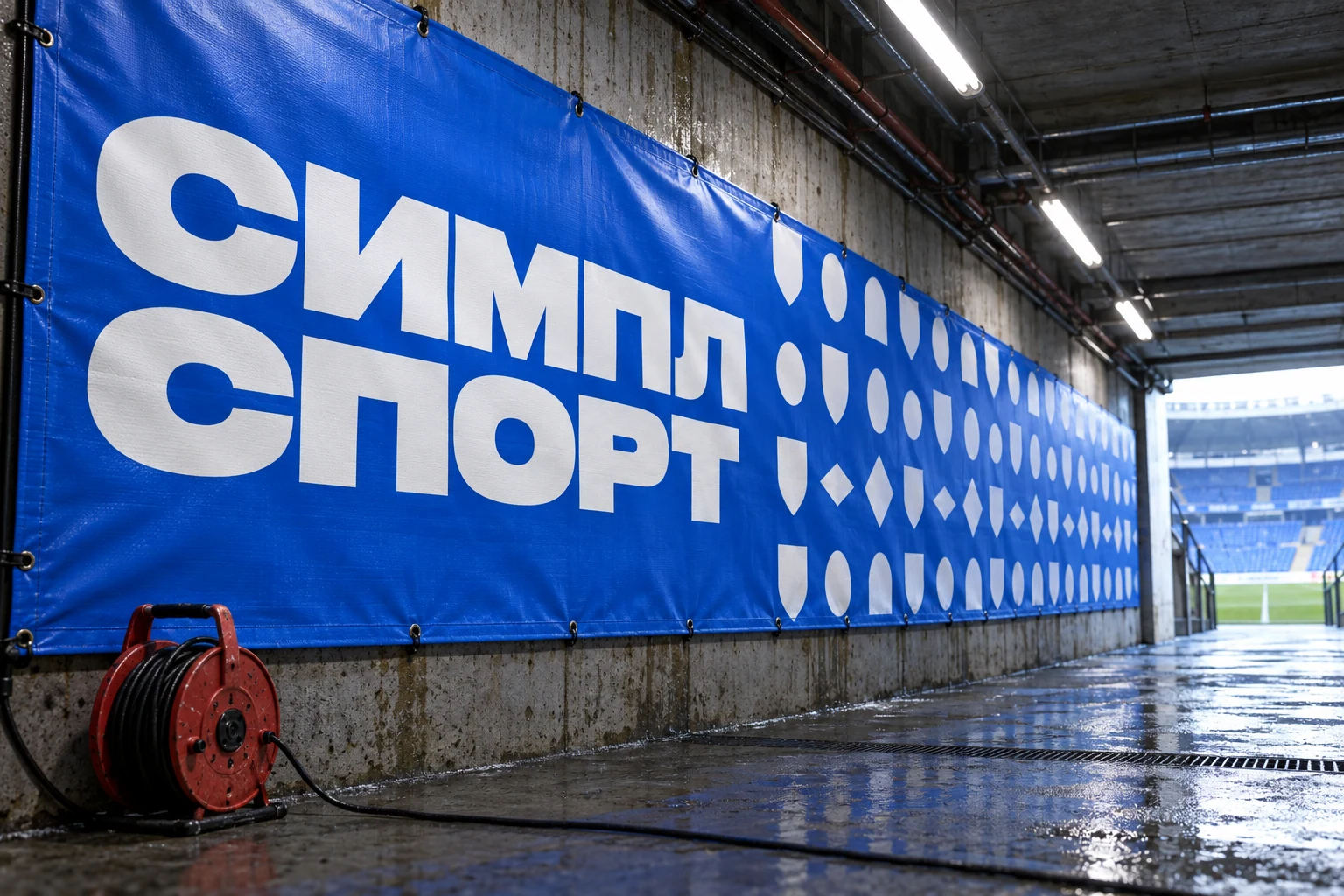
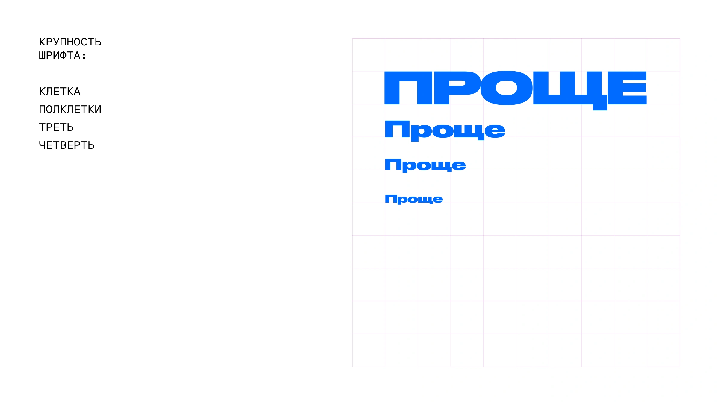
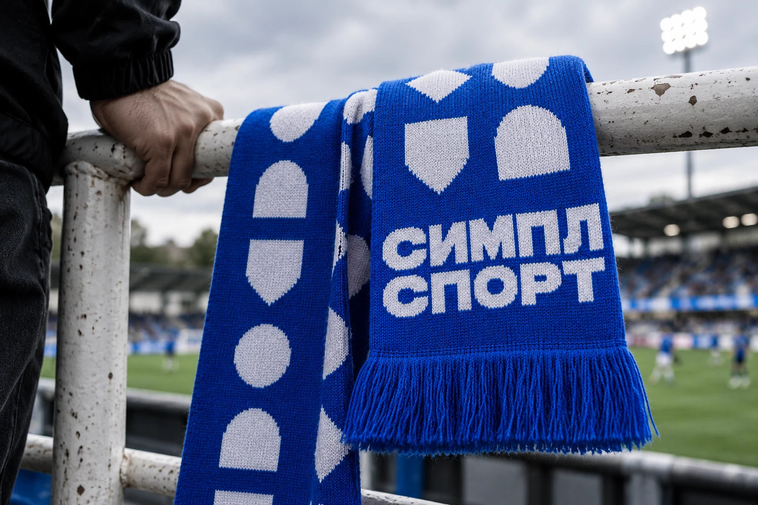
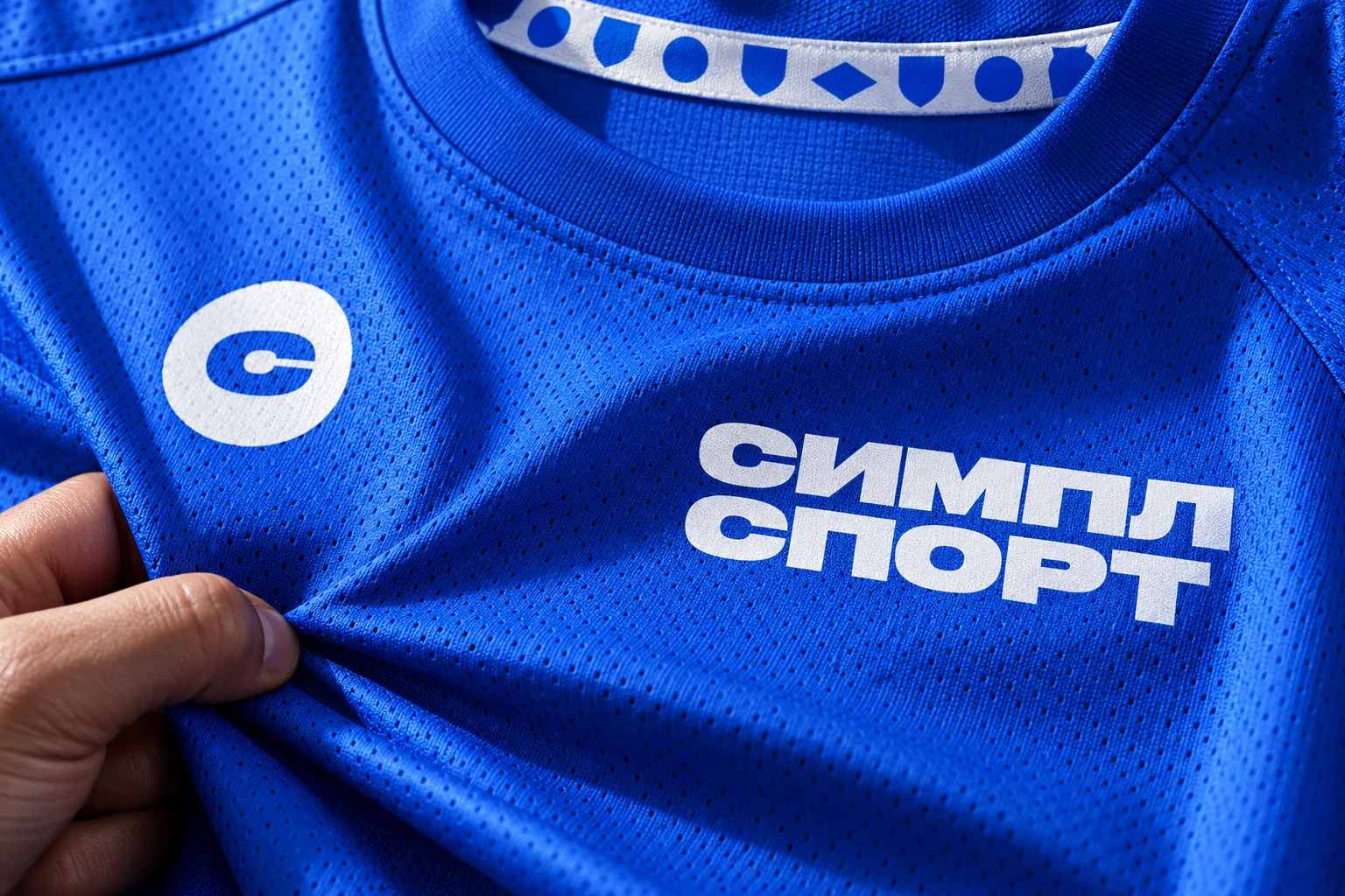
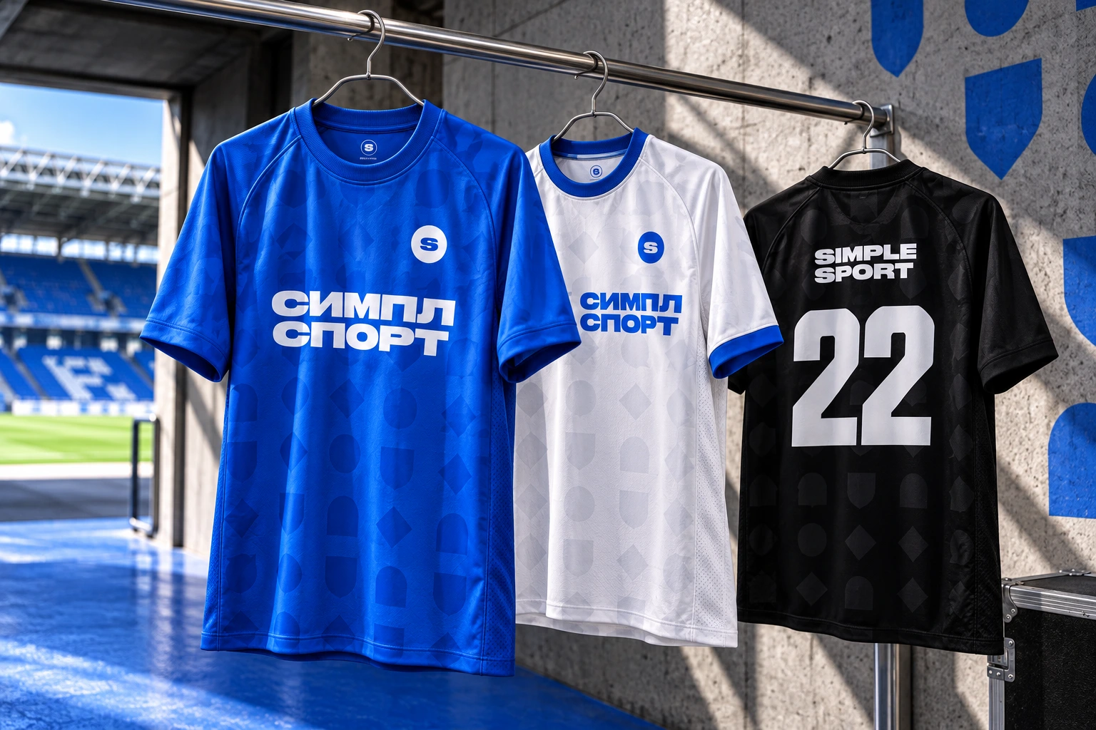
Wide letters. A quick message.
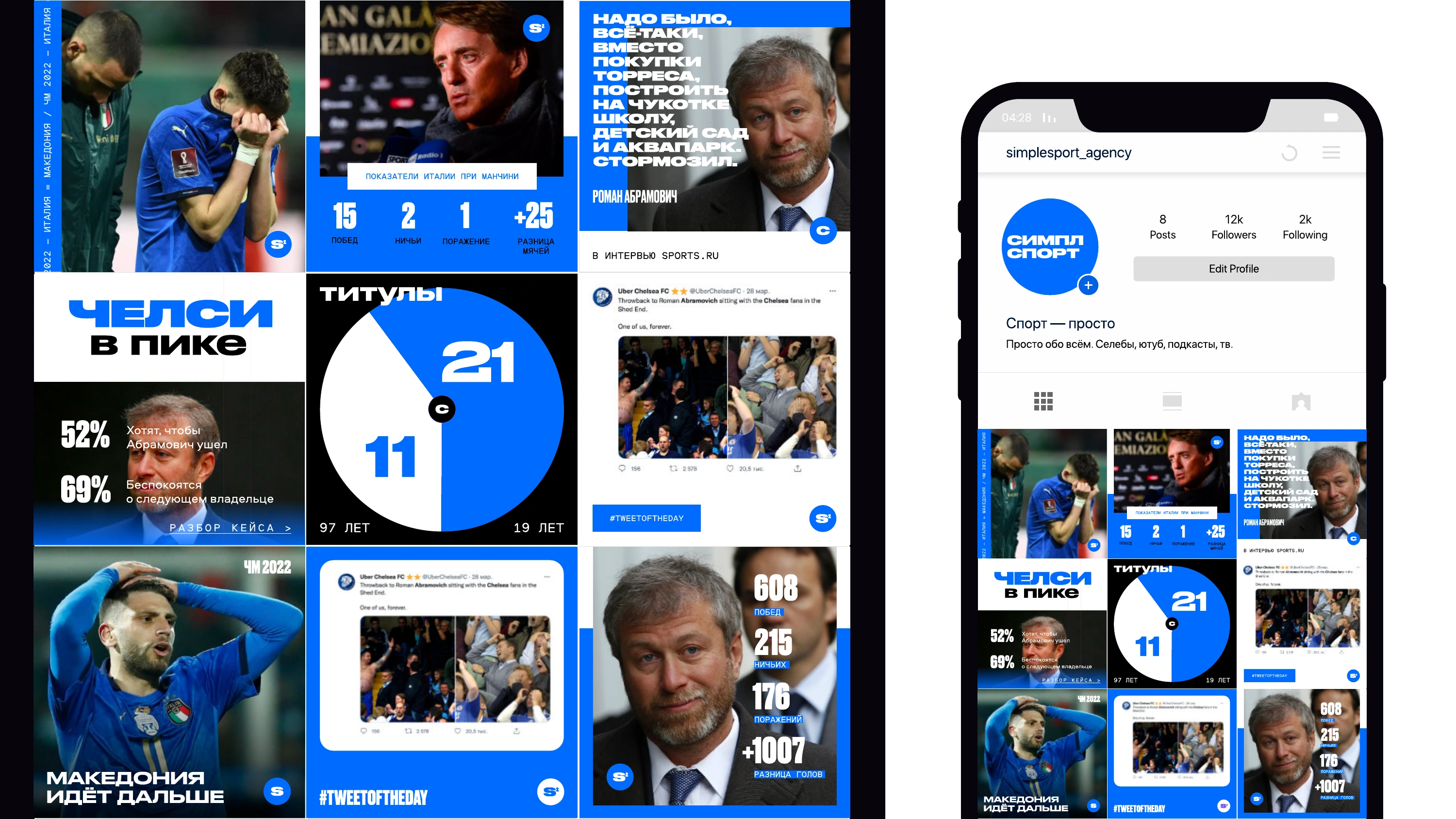
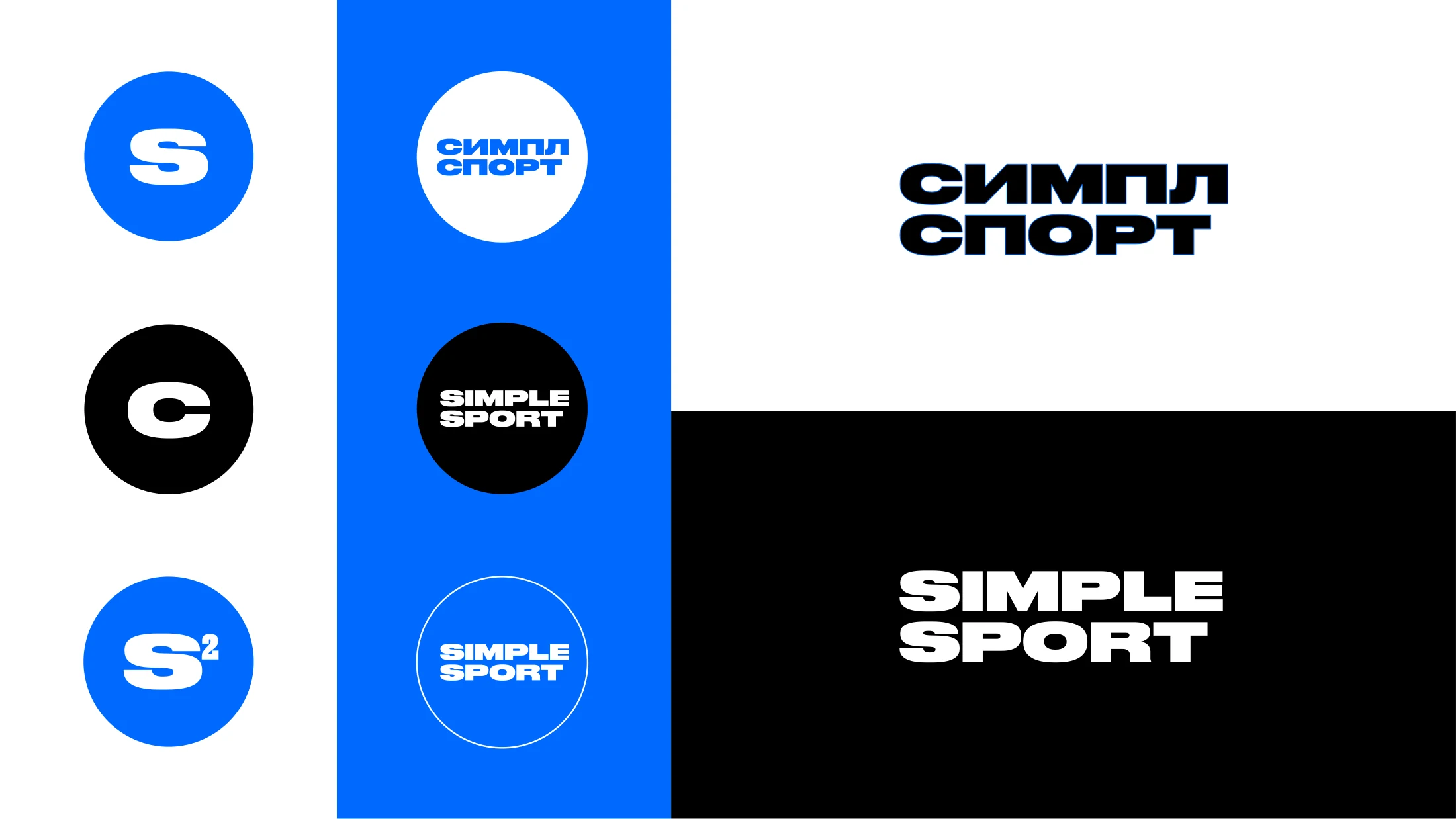
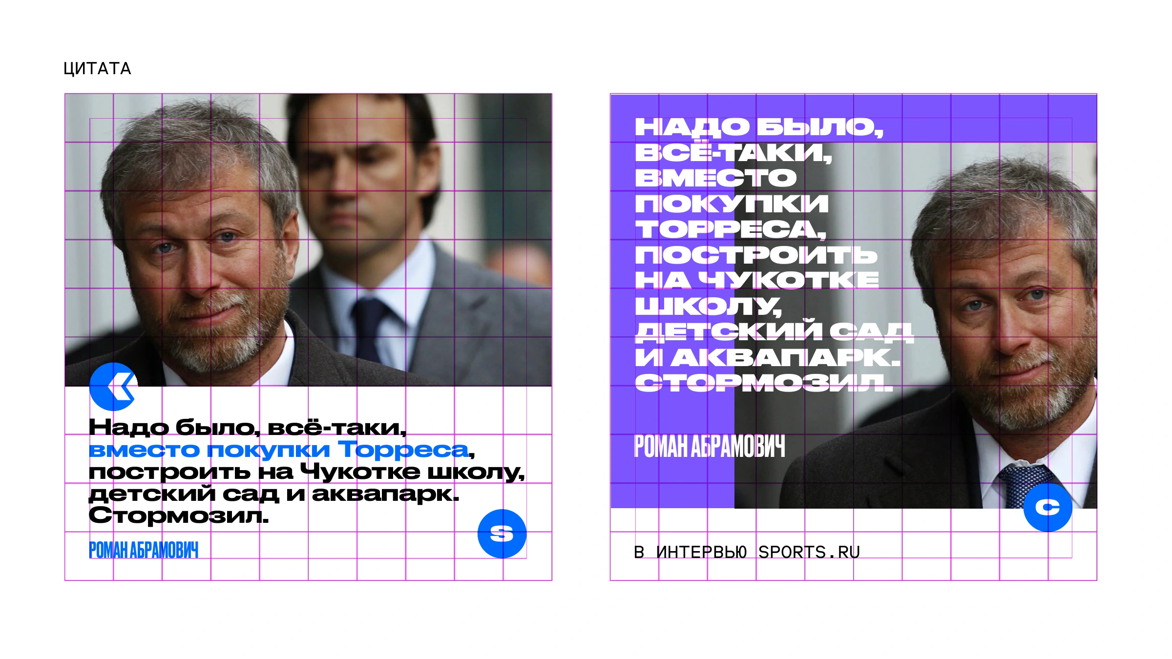
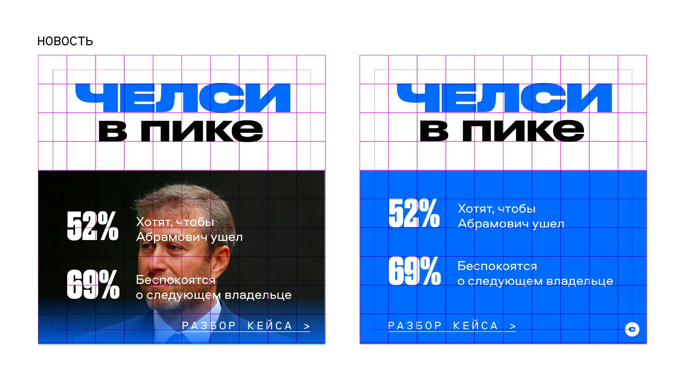
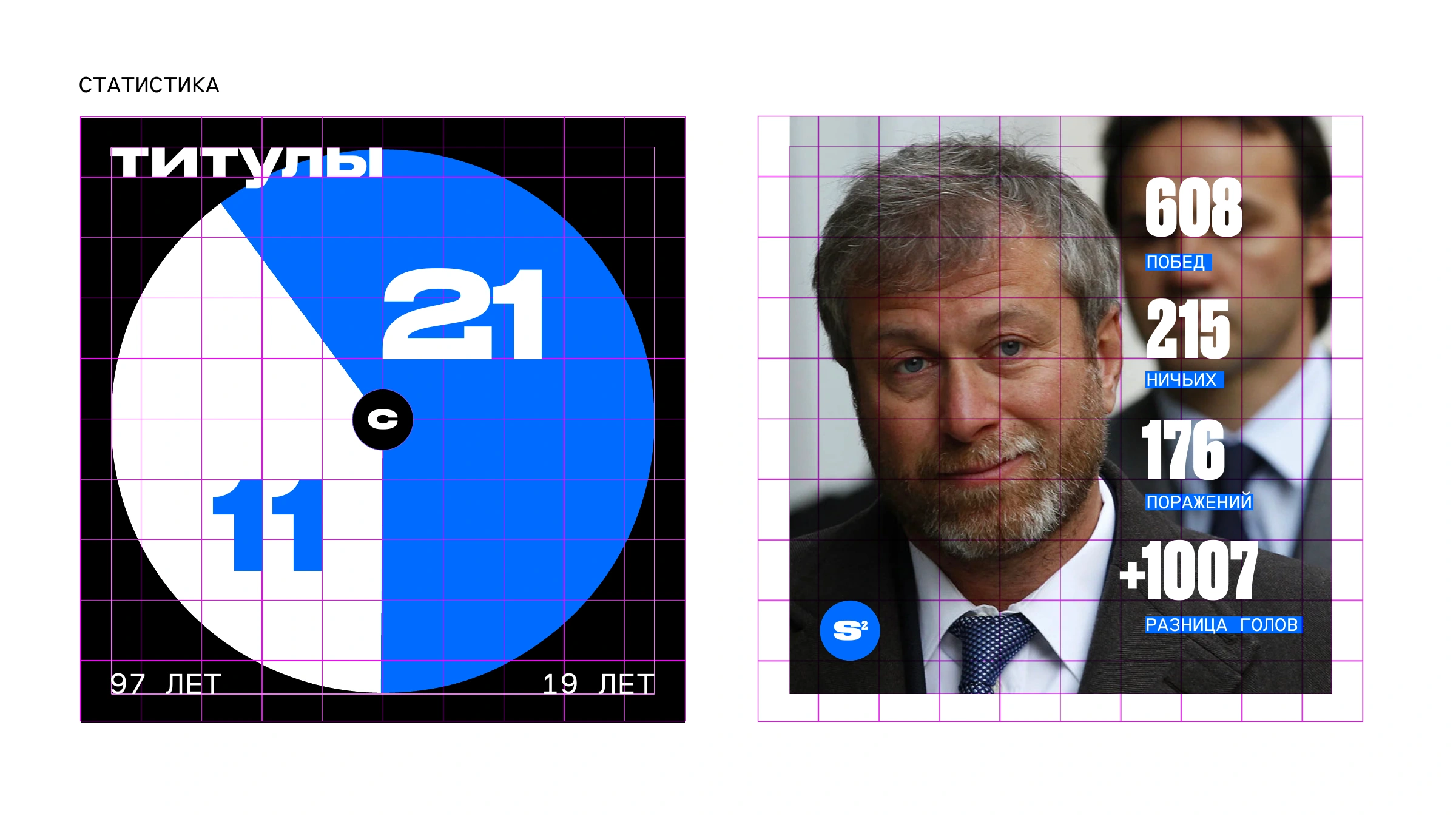
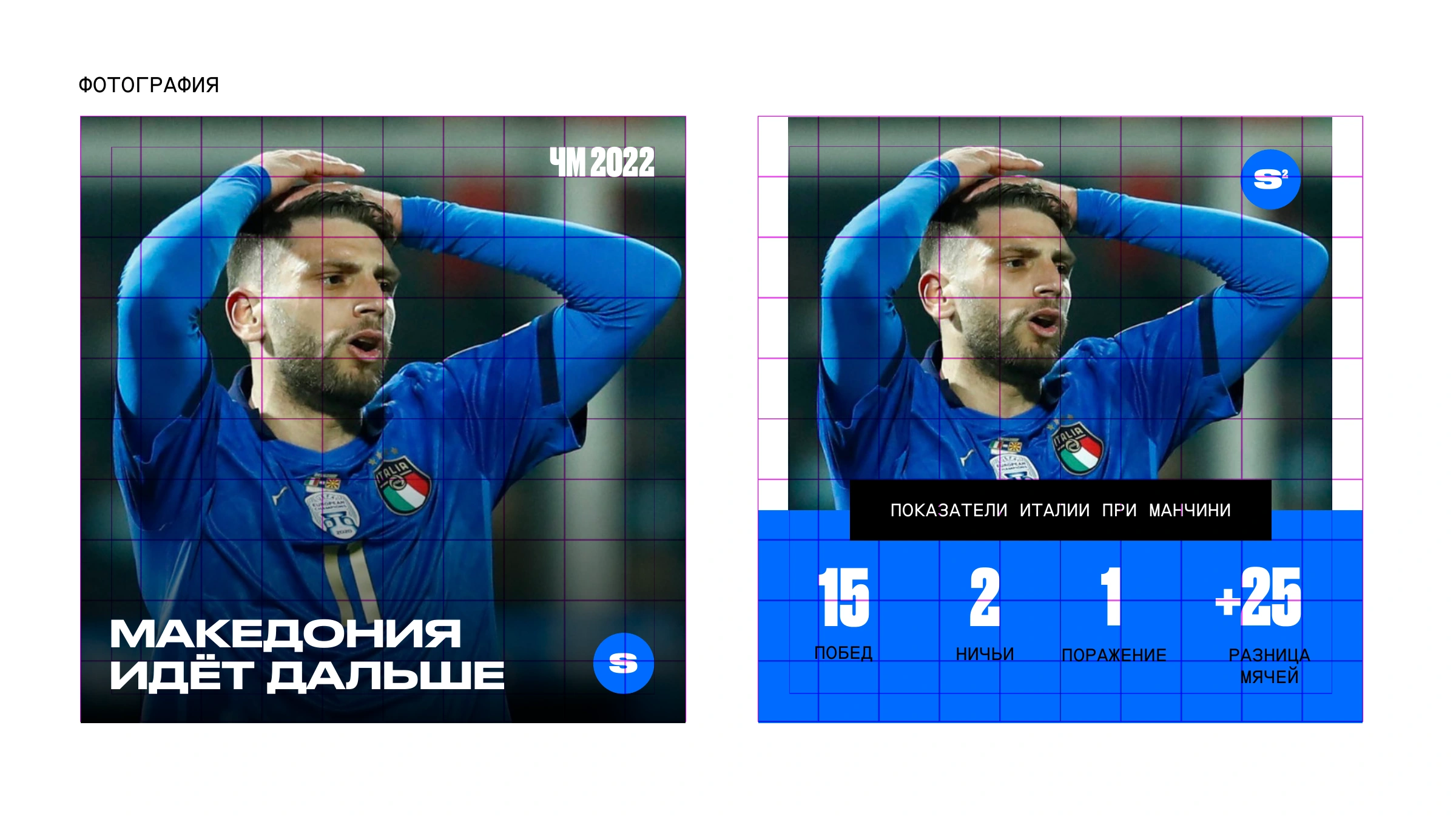
Simple Sport’s refresh had to accommodate news, quotes, statistics and photography. The solution was a set of editorial rules rather than a single layout. Contrasting typography sets the pace, colour distinguishes different treatments and short symbols connect the formats. Content can change while the sports publication retains its character.
Next project
DR417A feather-shaped mark