Mixrent
Identity for a transport-rental platform.

The experience of travelling comes first.
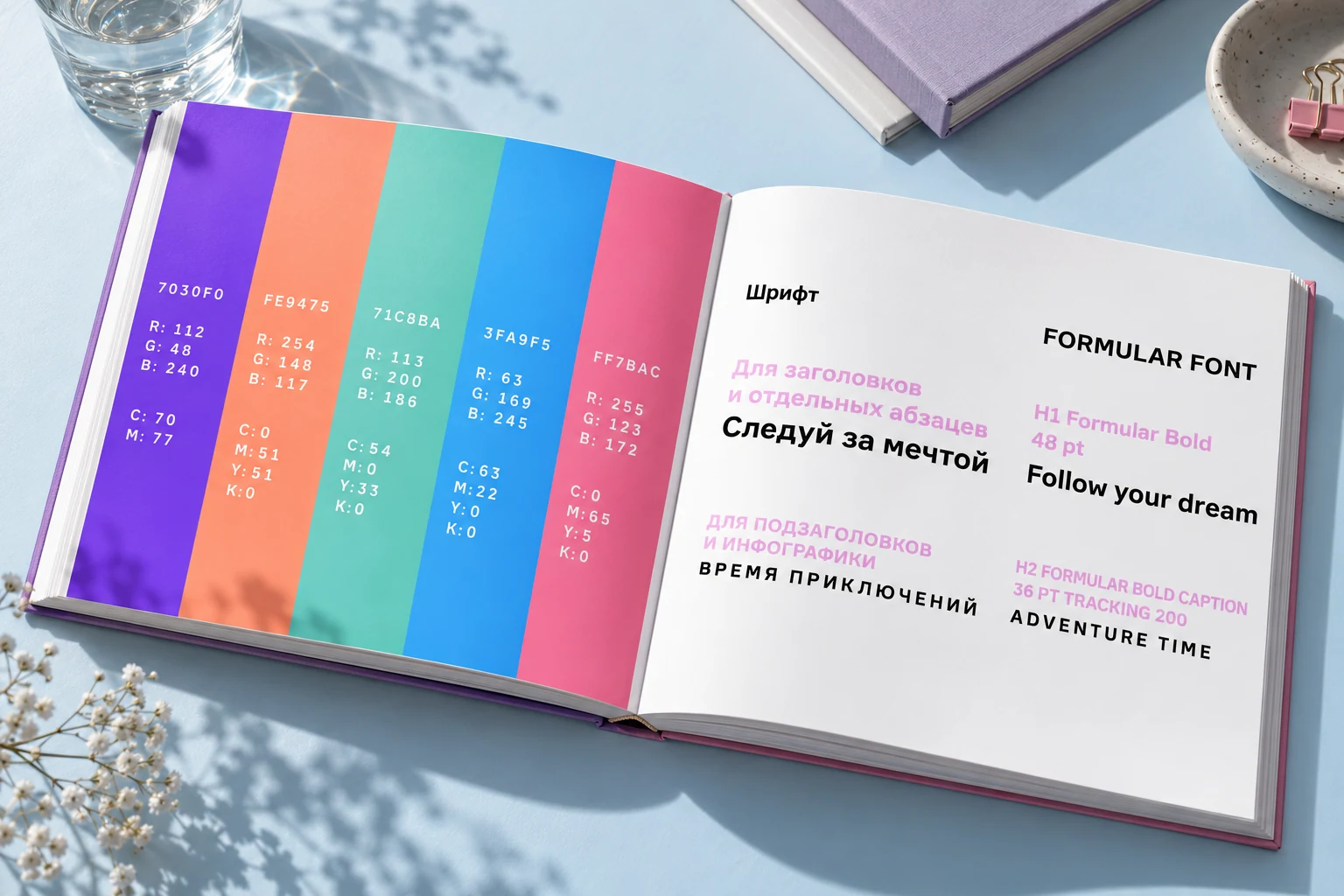
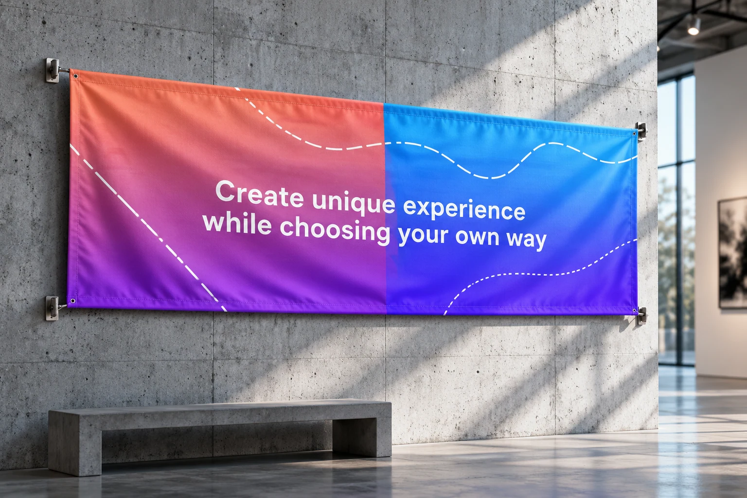
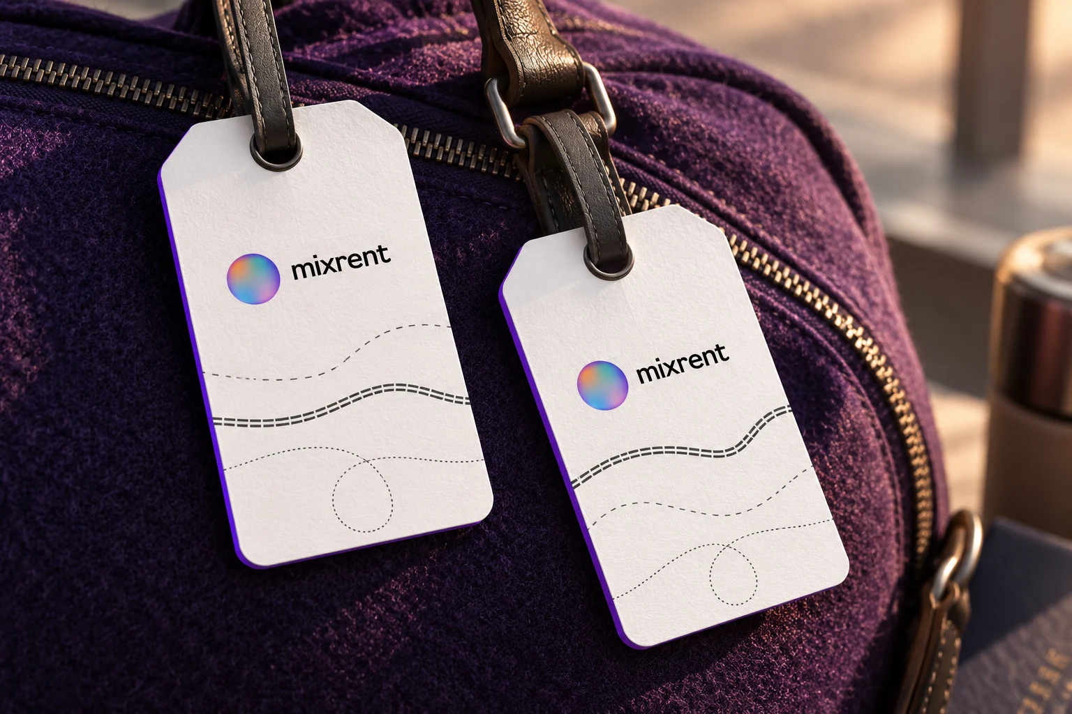
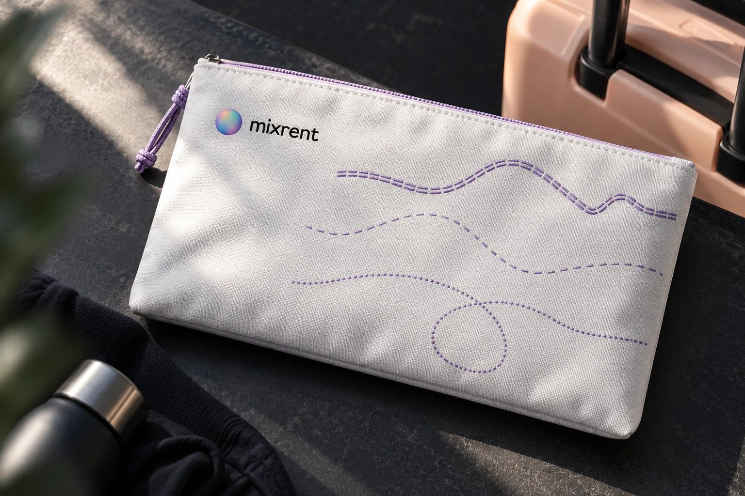
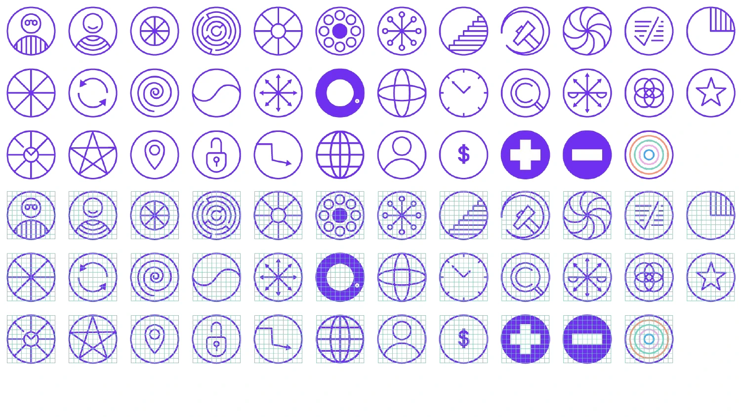
Mixrent’s brief brings different kinds of transport into one rental service. The identity addresses the journey as a whole rather than a single vehicle. Sky and water inform the gradient palette; route markings supply the graphic language. A shared circular grid connects the pictograms and keeps the system consistent.

Next project
Bird & CarrotA creative team’s website