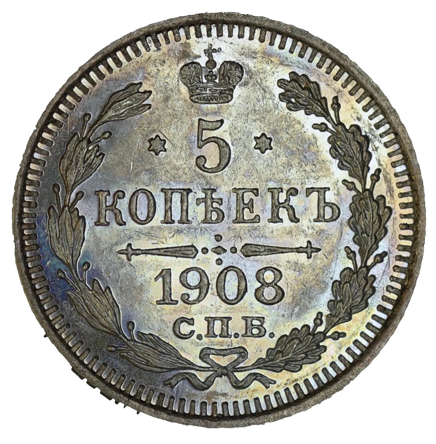
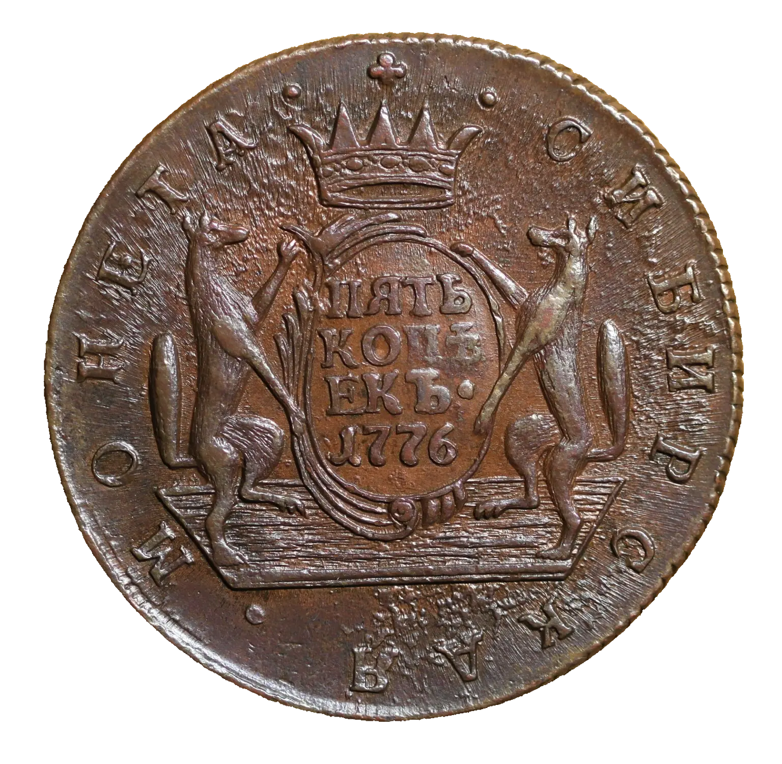
 5 kopecks, 1908Starting price300 000 ₽
Eternity
Identity and website for the Eternity auction house.
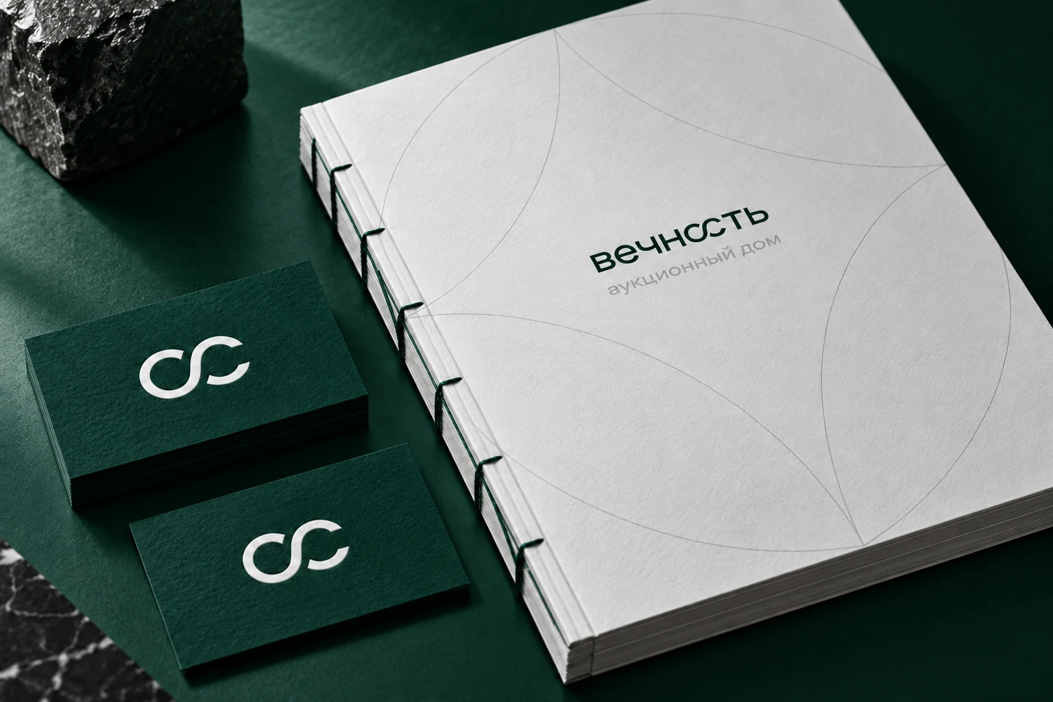
It was, it is, and it will be.
Eternity connects objects, their histories and the people who will carry them forward. The infinity symbol unites the identity and website. Online, the object remains central: visitors can examine it, compare lots and discover its story. Deep green, paper tones and clear typography connect the catalogue, auctions and editorial pages.
The auction house continues online
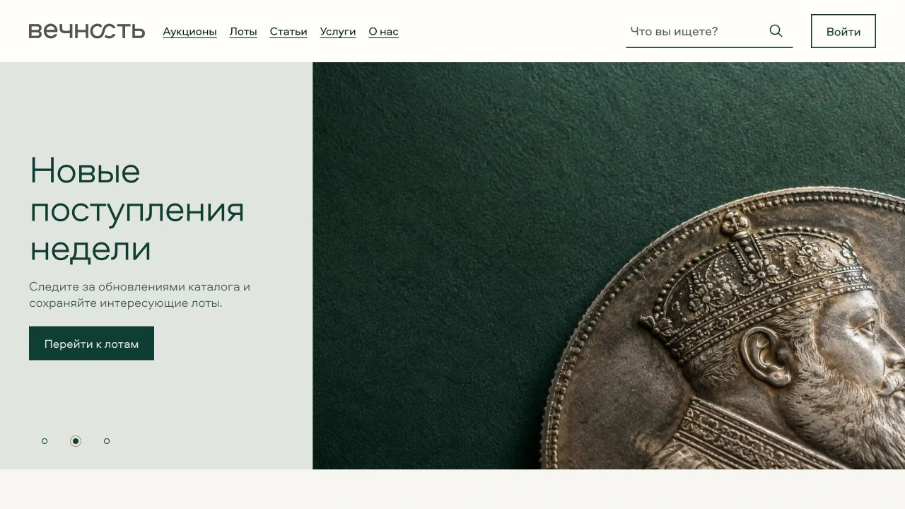
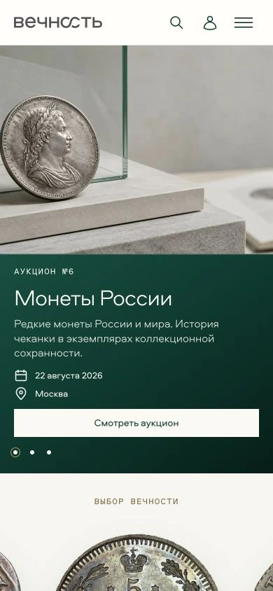
The homepage introduces the object before the catalogue. Large imagery, directional light and measured composition establish the viewing rhythm. This first encounter leads into an auction, a collection of coins or an object story. The screens below come from the developed website.
An endless gallery of coins
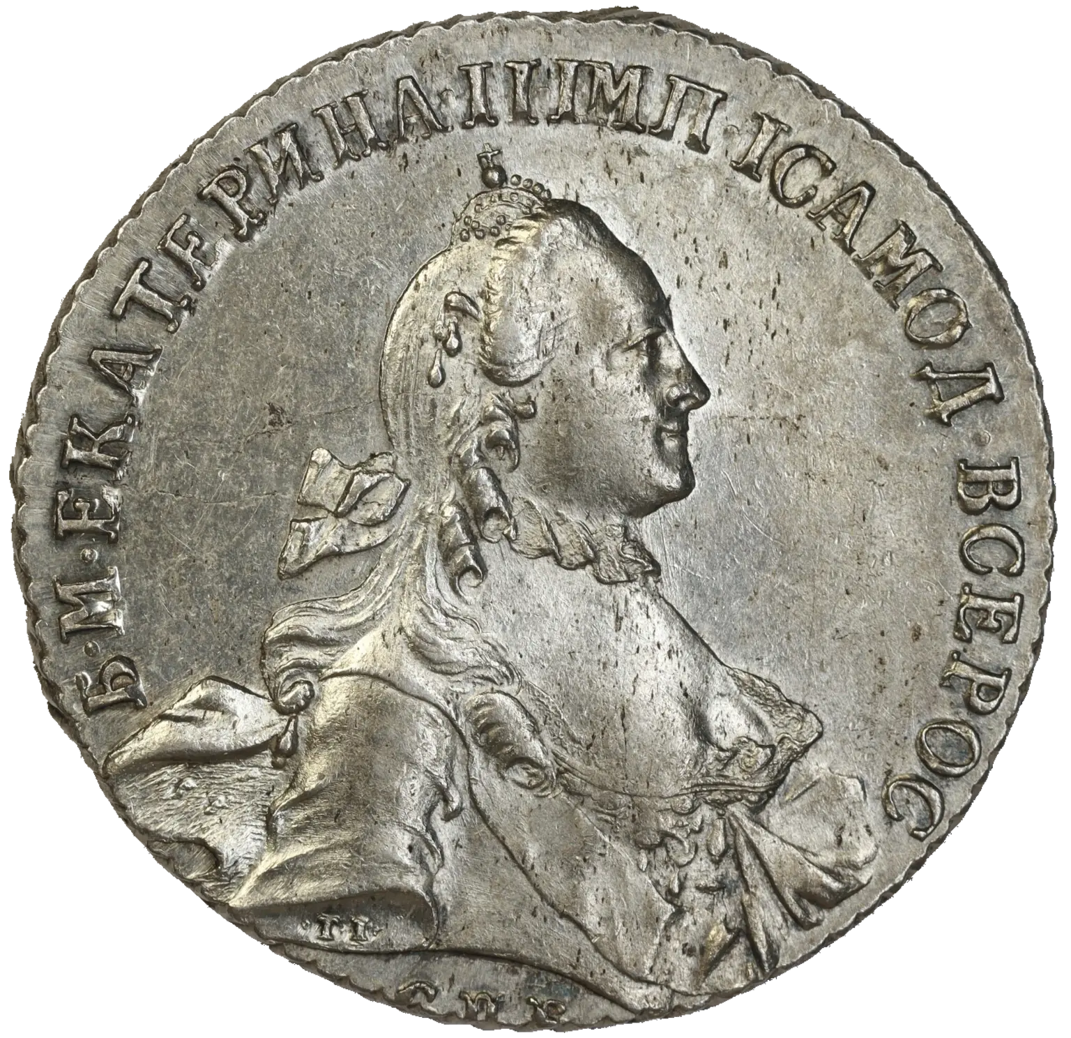
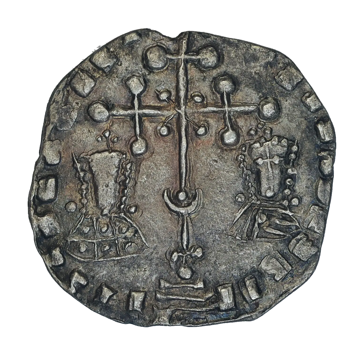
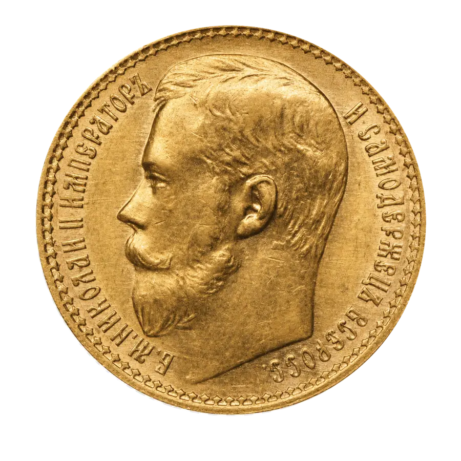
Coins move in a continuous loop: the central object comes forward while its neighbours remain in view. Pause the motion, browse with the arrows or a swipe, and follow an object to its lot or collection on the auction-house website. This case brings in the images, captions and navigation of the website’s Selected by Eternity gallery.
Selected by Eternity
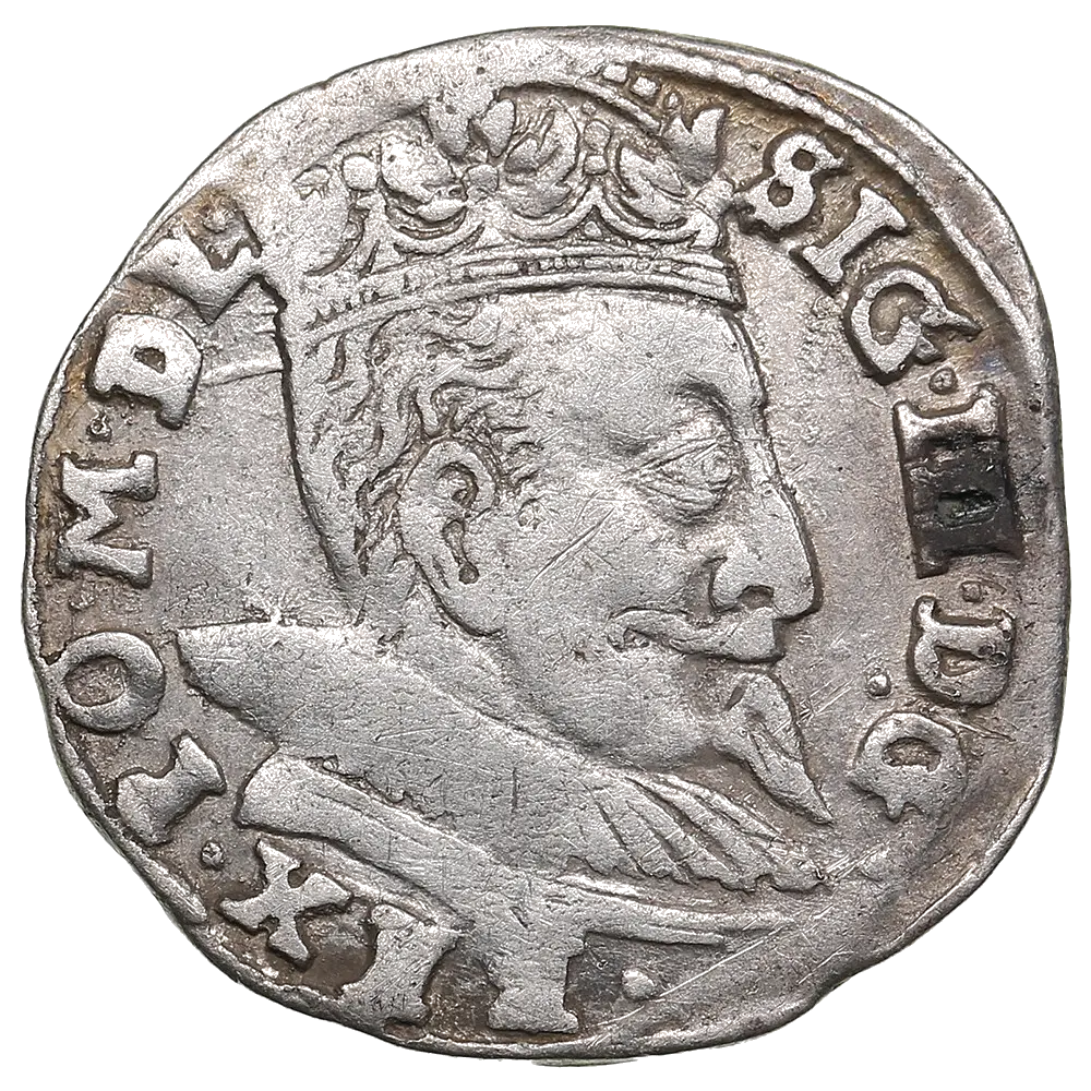
Coins that invite a closer look. Relief, traces of time and the character of an era.
The auction page
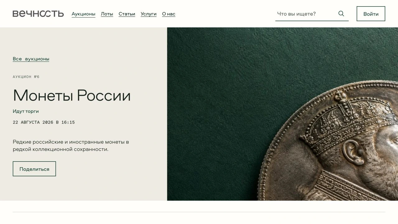
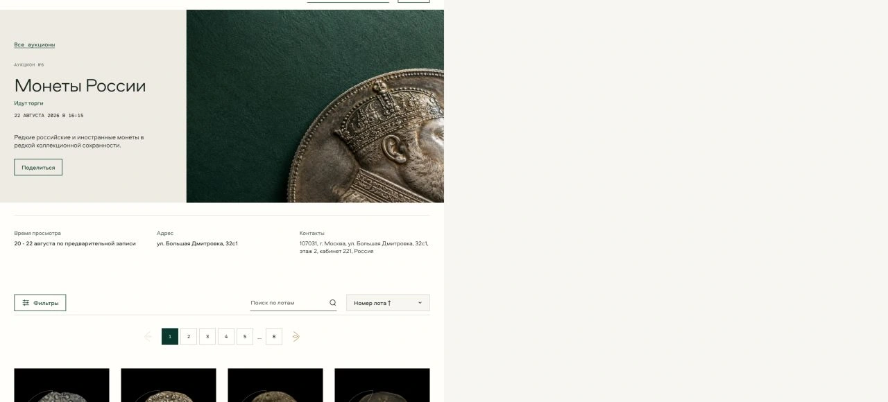
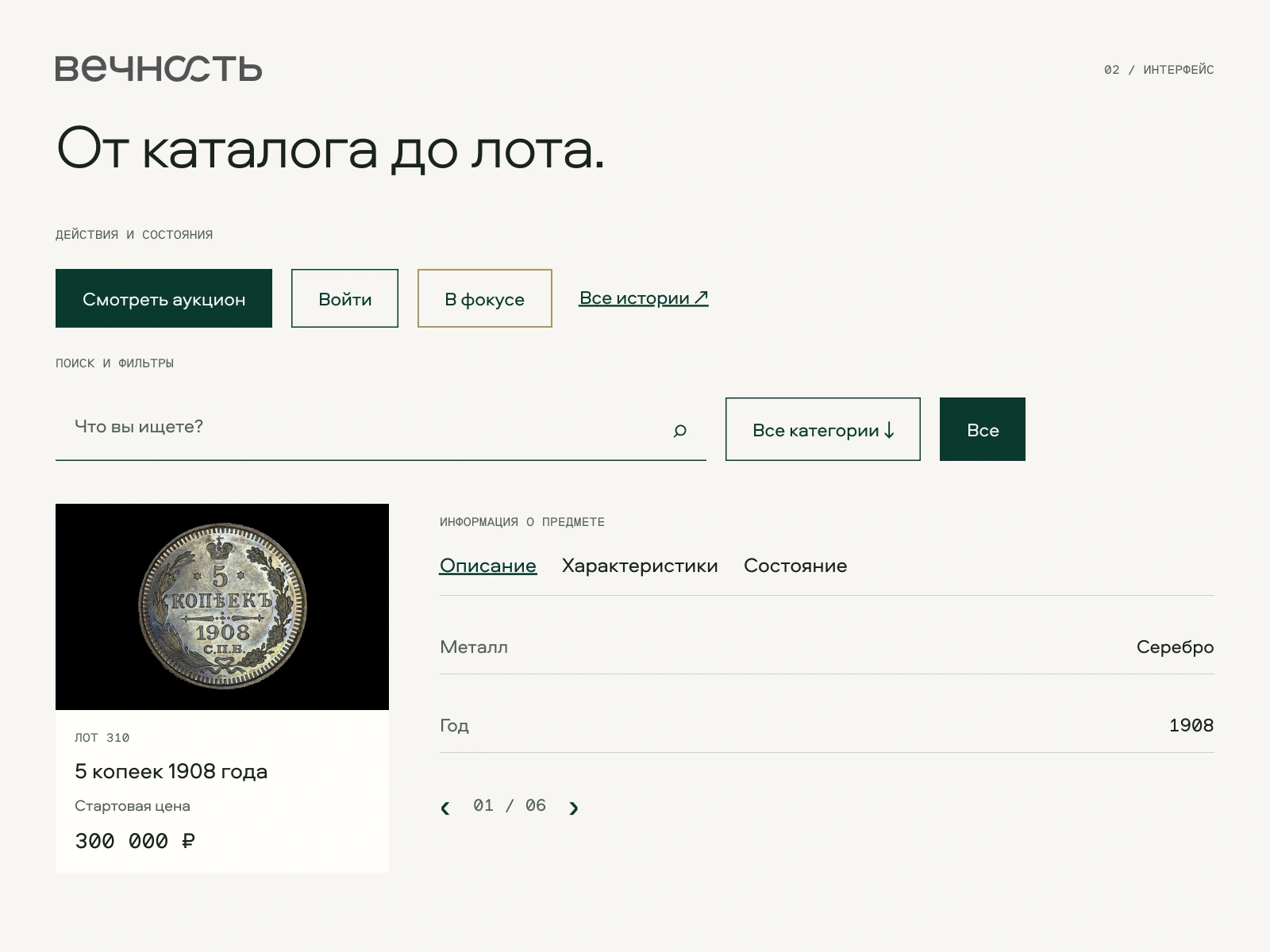
Each auction has its own object image, title and date. The cover leads into the catalogue, where categories, search and sorting help visitors navigate a large collection. Each lot’s title, starting price and photograph read as one unit.
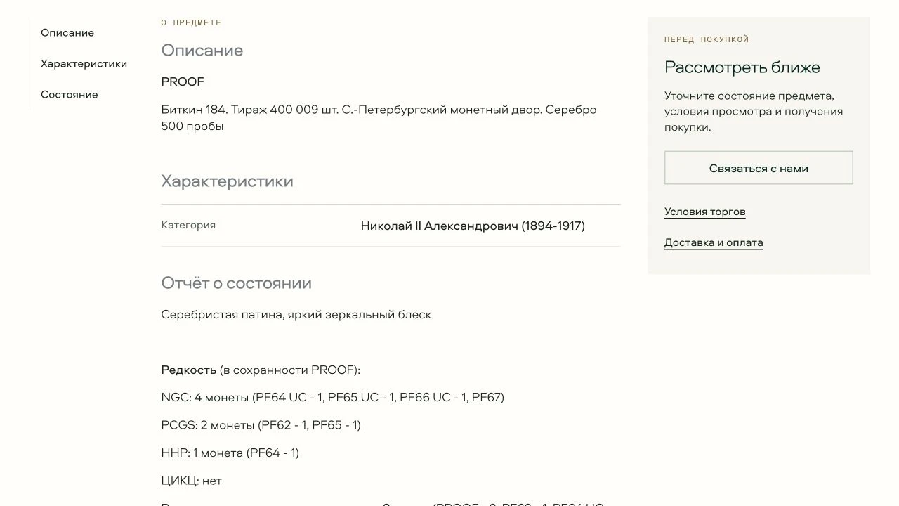
The lot page: the object comes first
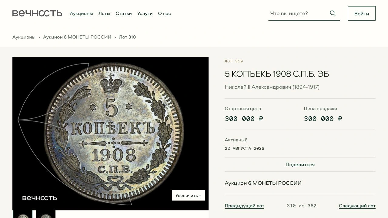
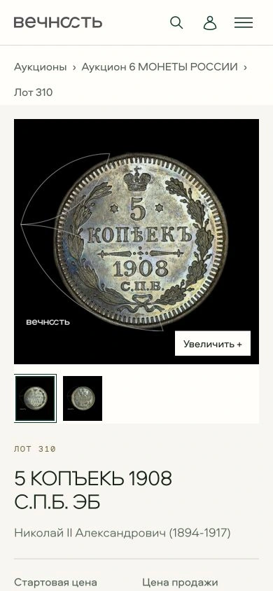
The large image takes up most of the screen. Its title, origin, price and adjacent lots stay close at hand. Below the photographs, a second layer reveals the description, specifications and condition report. Visitors can first examine the object, then study the details.
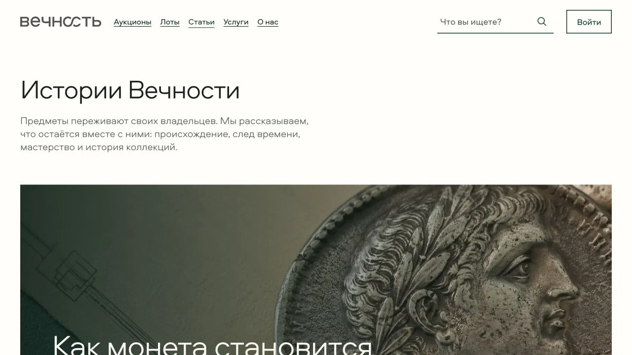
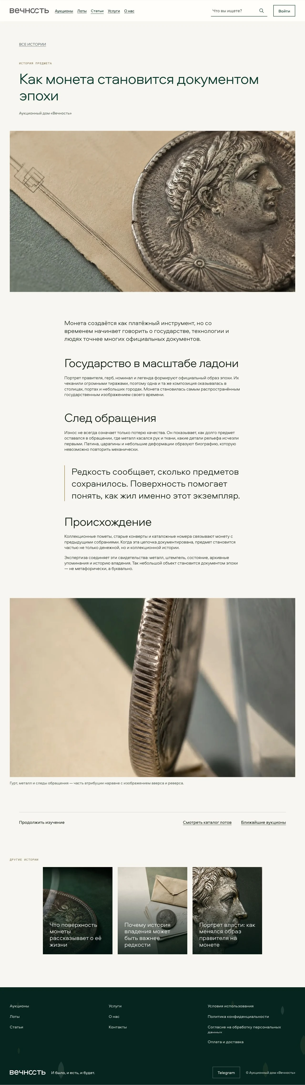
Every object has a story
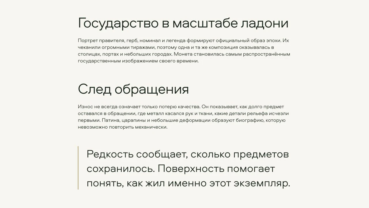
The editorial section explains what lies behind rarity: provenance, surface, traces of circulation and the history of a collection. The story index and long-form articles work at different scales, with expressive covers, a measured reading column, large quotes and object photography. Scroll within the full article image to explore the page.
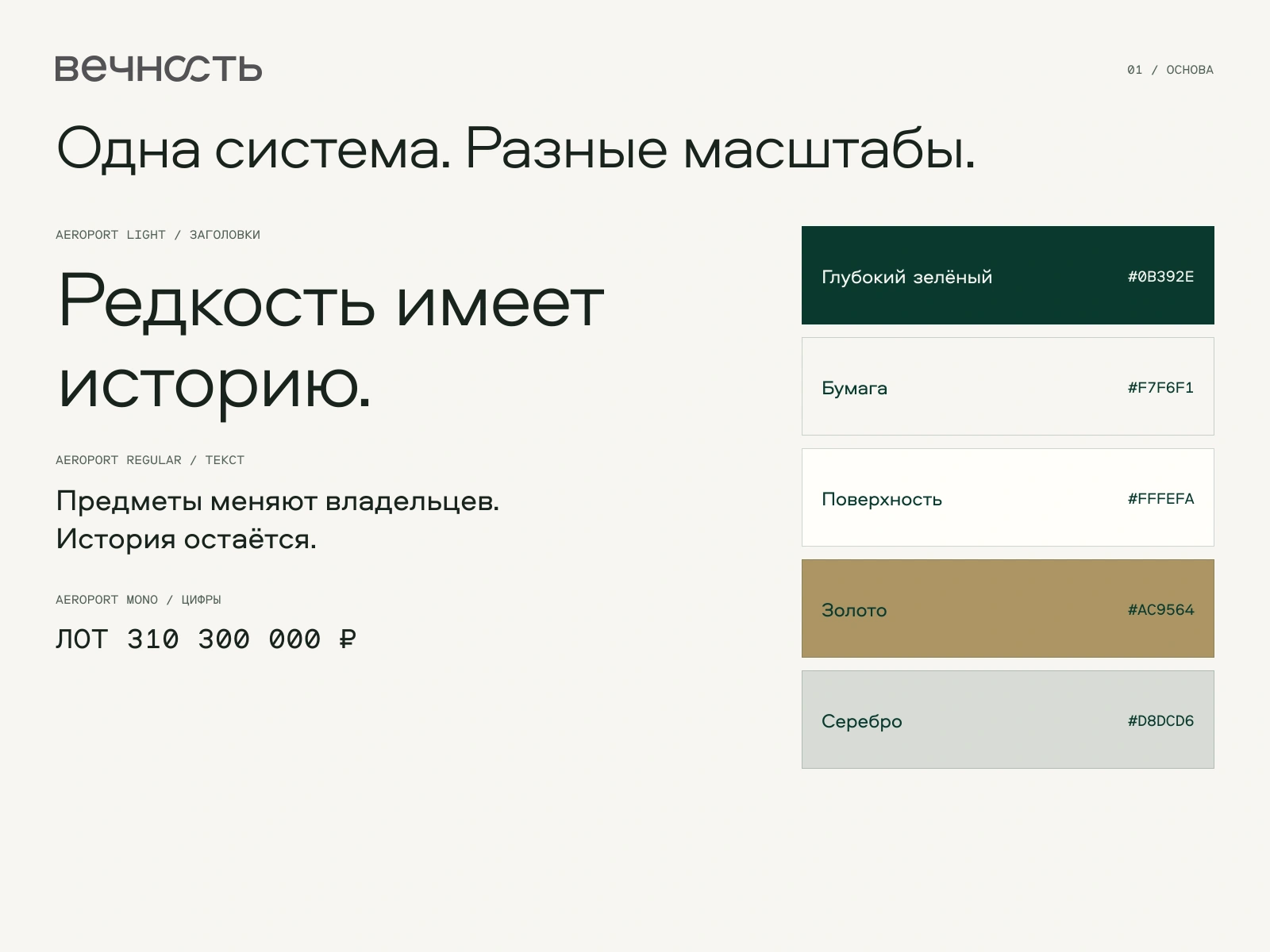
The design system
The system connects editorial presentation with the working interface. Aeroport Light shapes large headings, Regular handles copy and controls, and Mono distinguishes prices and numbers. The palette, thin rules, buttons, fields, filters and cards maintain one character across the site. These plates bring together elements of the developed interface.
Across large and small screens
On a phone, image, meaning and action form a sequence. The large object, generous margins and distinctive typography remain, while information carries through from the cover to an individual lot.
The texture of time
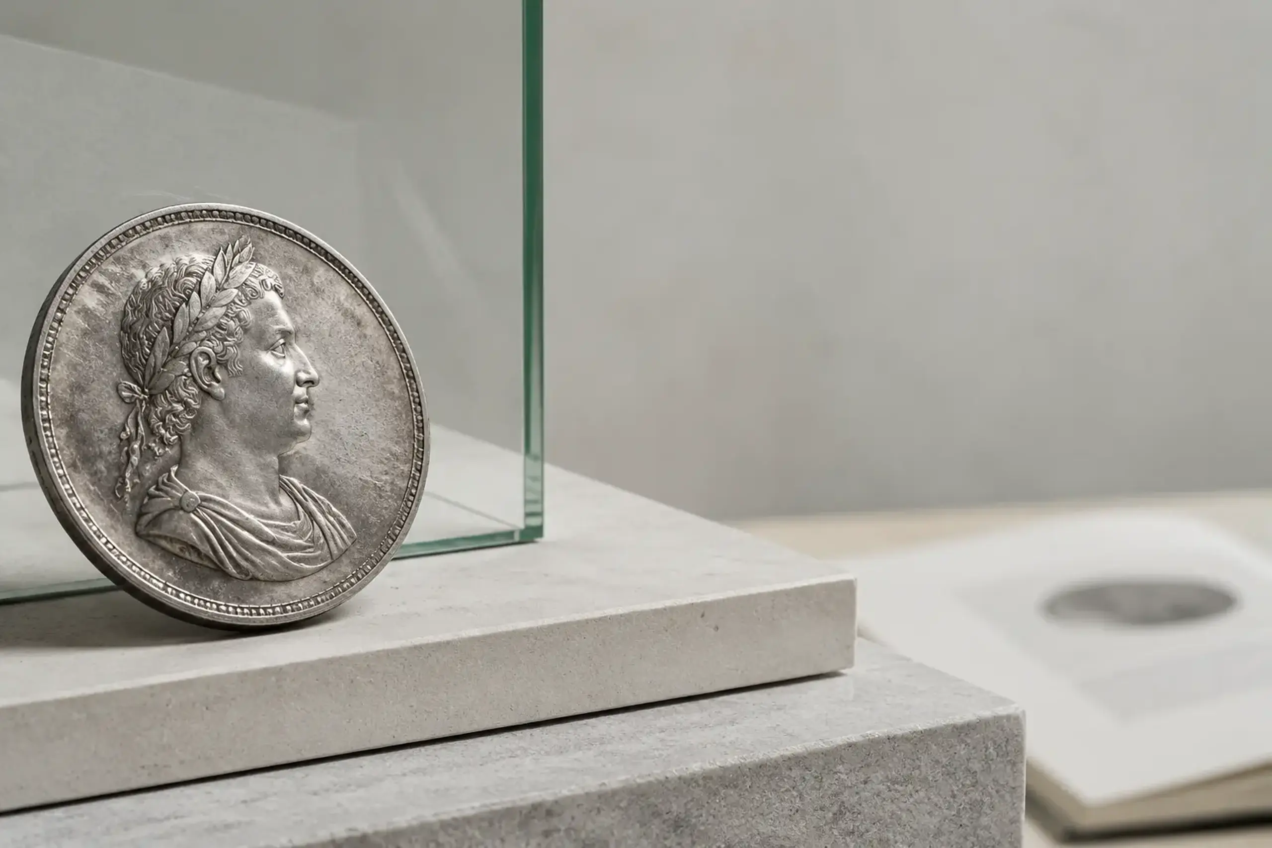
Object photography gives the coins space. Green glass, pale stone and paper support the metal tones; the large scale reveals patina, relief and the coin’s edge. These images appear in the website.

The mark beyond the screen
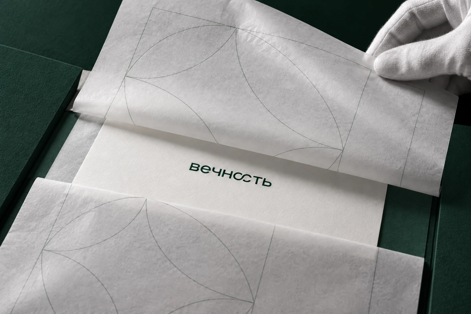
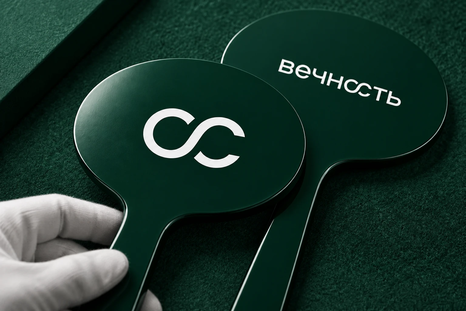
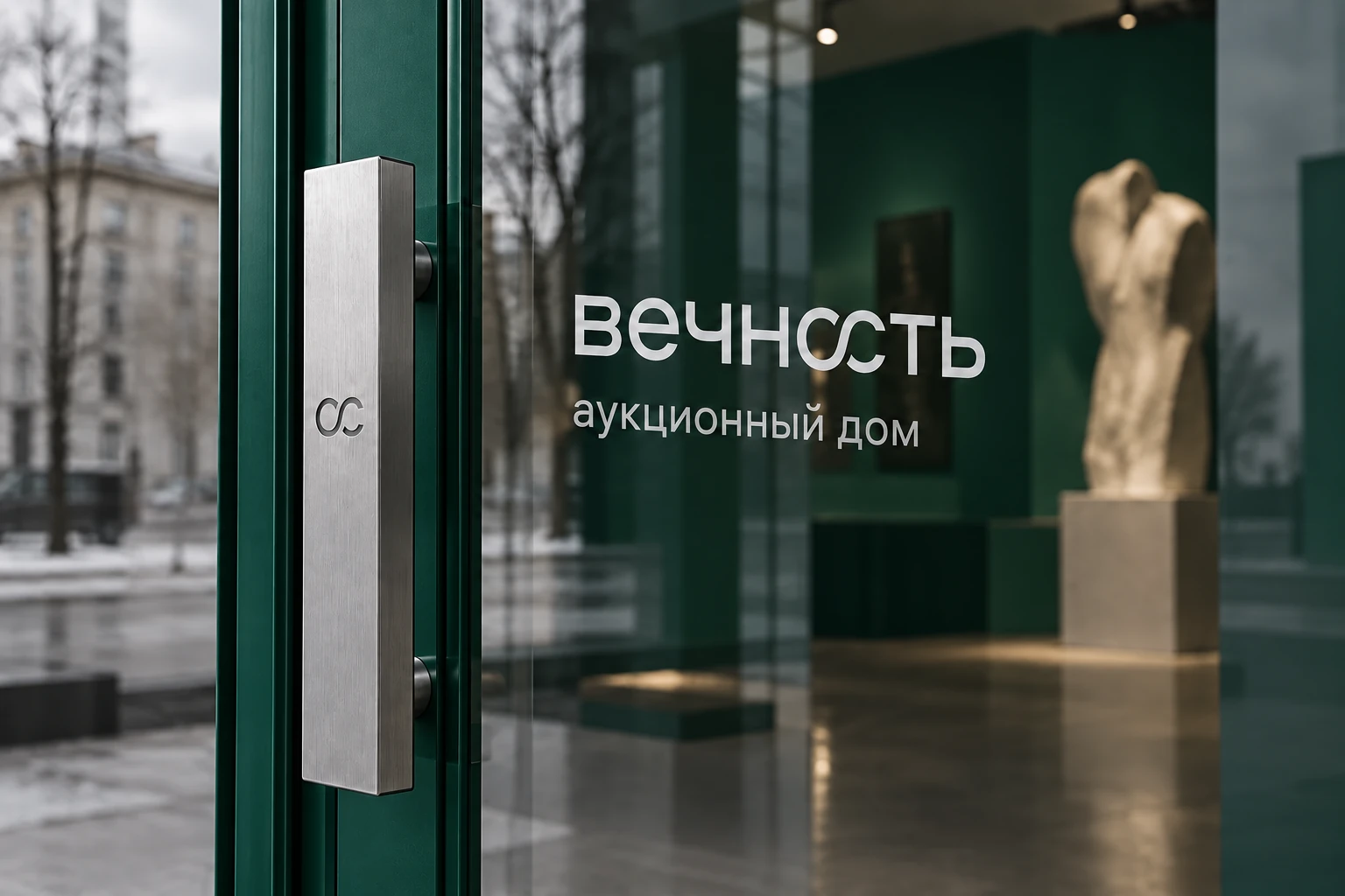
The fluid infinity sign works both inside the wordmark and on its own. On paper it becomes a fine ornament, on an auction paddle a recognisable mark, and on glass and metal a detail of the environment. The website carries this identity forward.

Next project
MeraA space for care